Team: D. Costa, A. Tarrisse (Developer); Germany, 2021 (3 months)
My role: UX Research, Content Strategy, Information Architecture (IA), UI
My role: UX Research, Content Strategy, Information Architecture (IA), UI
Context
The pandemic created the need not only to learn how to cope with the social isolation but also with the ensuing anxiety of the whole situation. People turned greatly to meditation apps. Insight Timer started out as only a timer. Building up a community the app grew to be one of the top meditation apps and the one with the most (free) content for guided meditation and live content.
Challenge
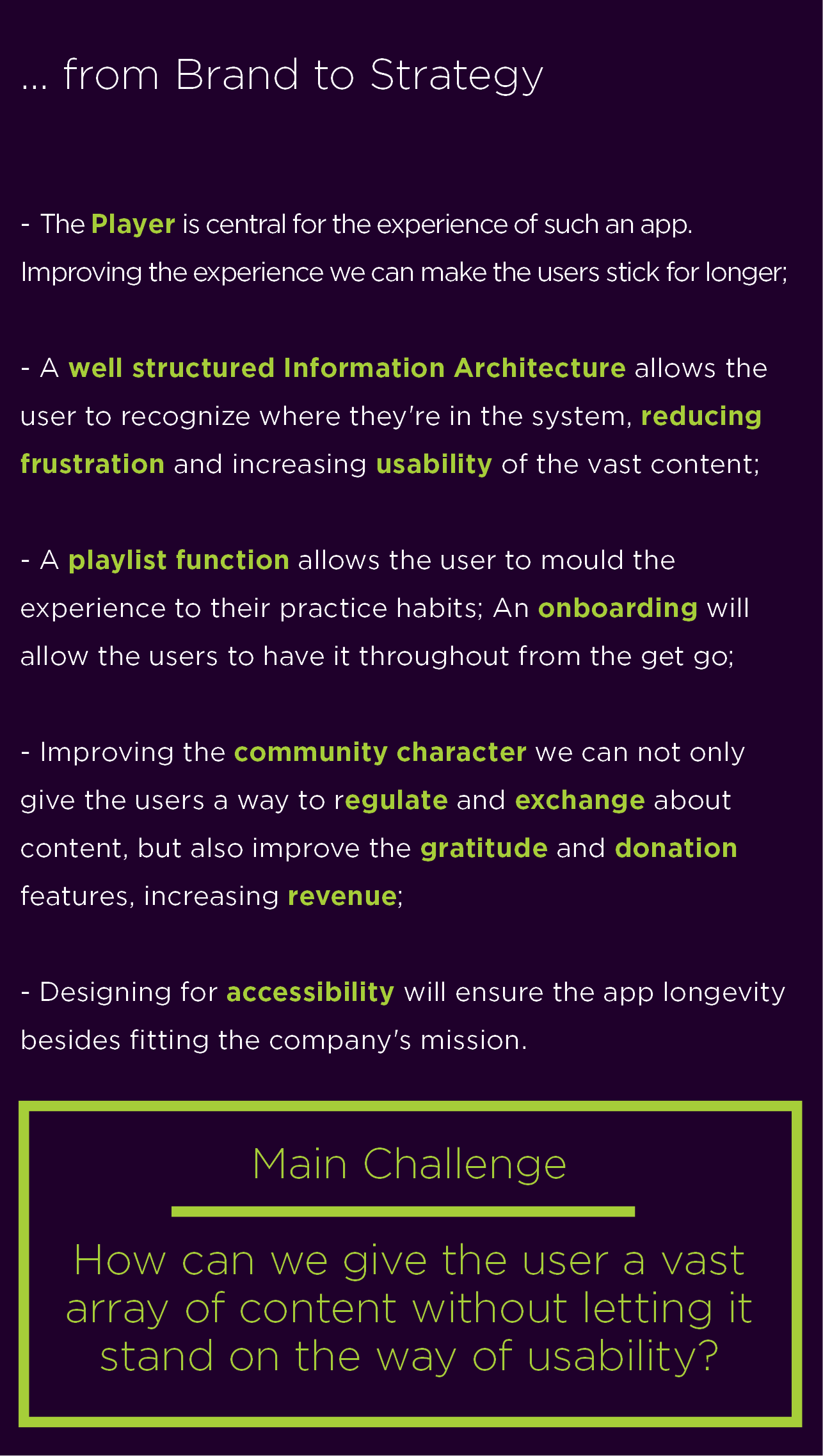
How can we give the user a vast array of contents without letting it stand on the way of usability?
Strategy & Solution
With insights and input from interviews with real users, online product reviews, and benchmark analysis,
we followed a content first and OOUX approaches for Information Architecture,
in order to optimise relevant content search, provide relevant features, while ensuring content scalability and profitability and accessibility.
for people with different levels of expertise in meditation.
Therefore special attention was given to content's architecture and the player feature as it is in the middle point of all interaction. An atomic design approach was used to develop the design system. The UI was not only user but also brand oriented, suggesting a branding direction in order to streamline the visual elements, and increase trust.
Scope
Content Audit, User research, relevant features definition, Branded UI
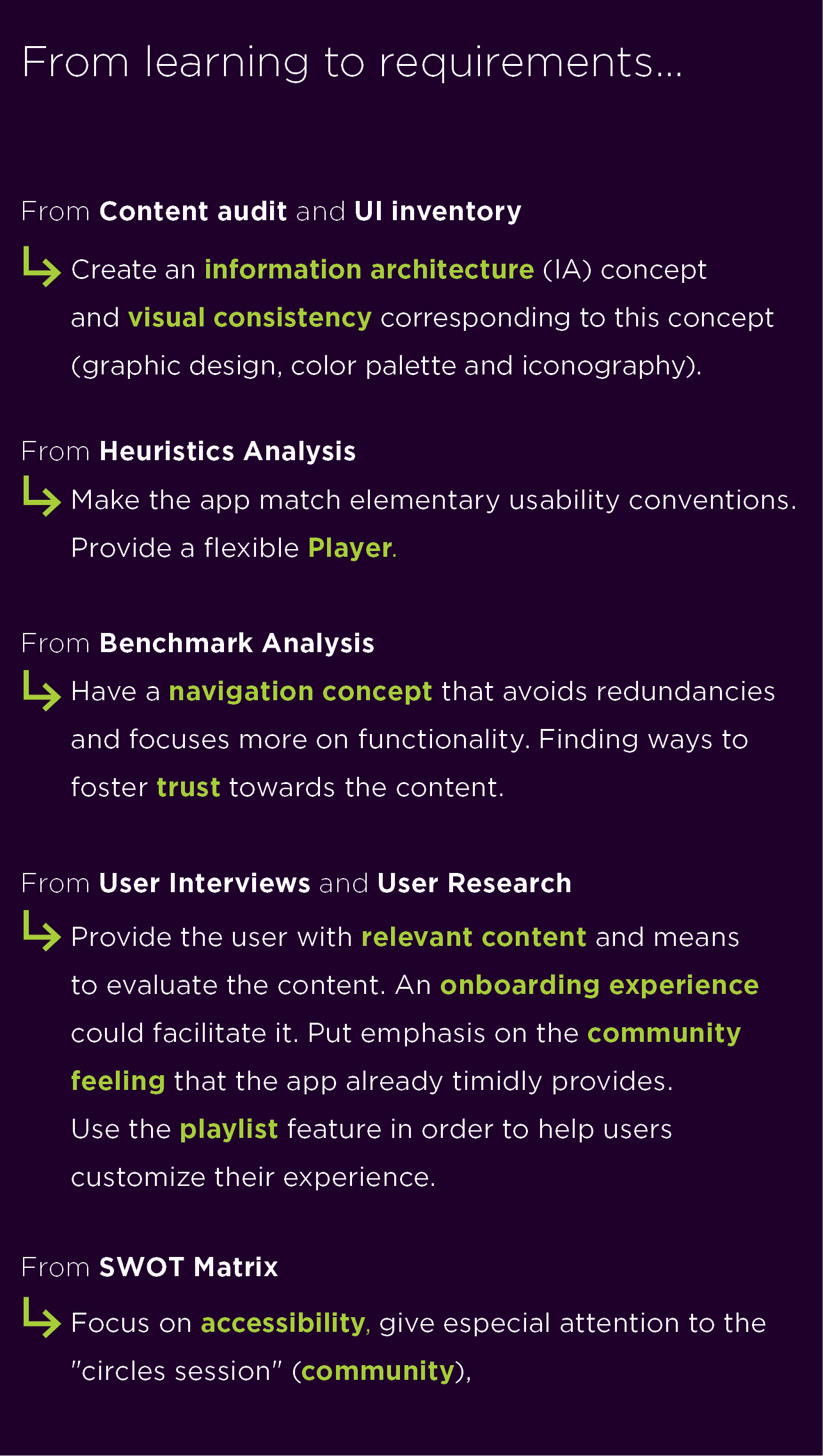
• Analysing & Learning •
A. Audit: UI inventory
B. Audit: Content Map
Good news
- A vast array of contents;
- Many different teachers;
- Well labeled content.
Bad news
- Structural and search problems;
- Semantic and pragmatic issues in content distribution;
- Not much practice oriented (experience levels).
C. Analysis | Usability heuristics evaluation
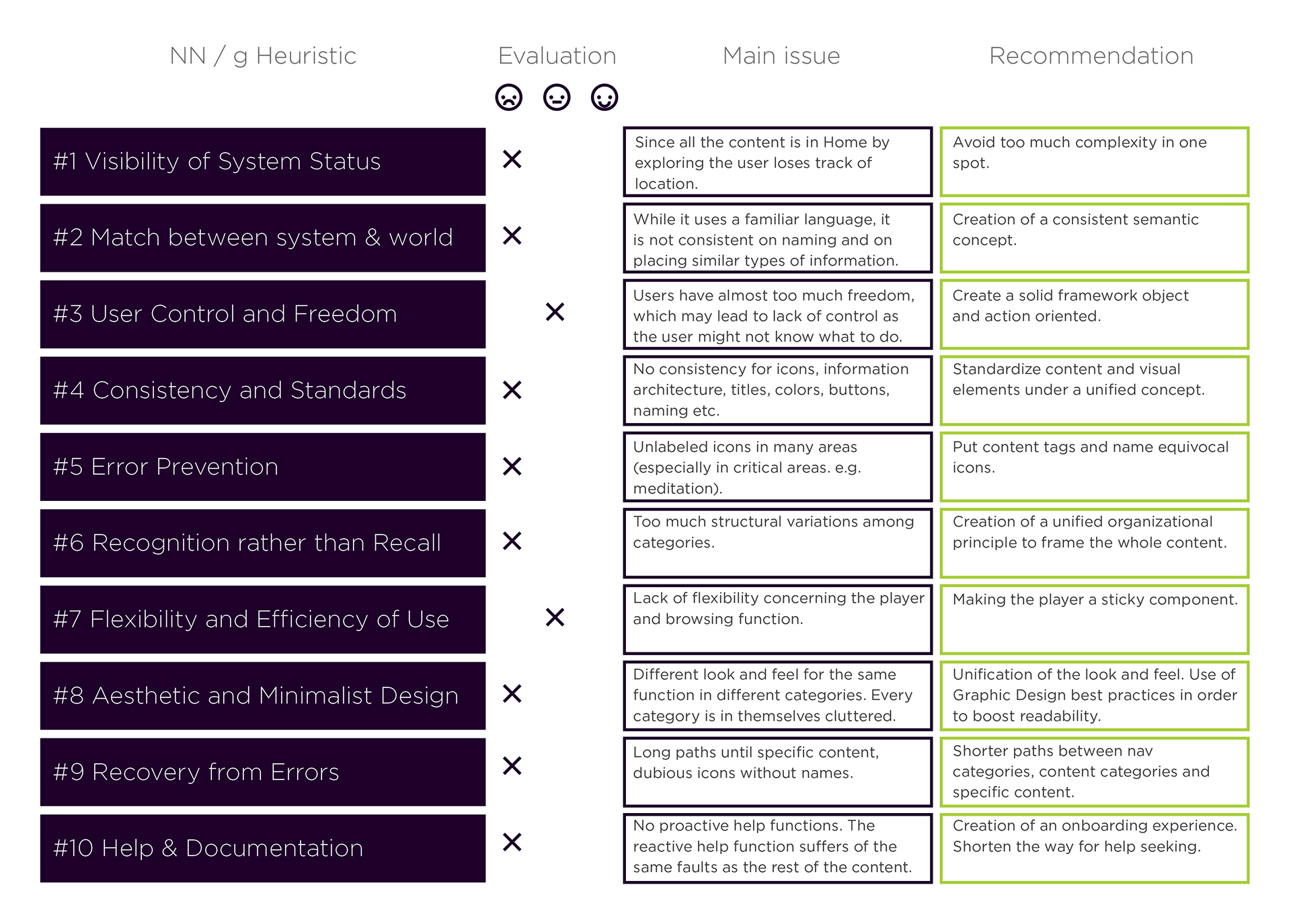
The lack of consistency leads to usability problems
The Heuristics evaluation (as laid out by the NN/g) allowed up systematically access and anticipate usability issues. At this point not to trace those issues back to the information architecture was unavoidable. In our evaluation the app falls short in most of the heuristics.
Next
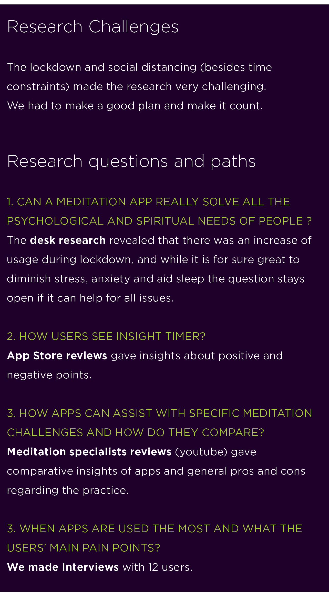
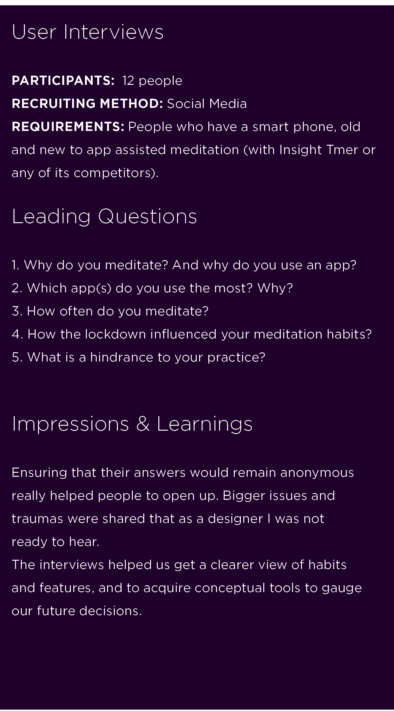
We had to discover how the app measures up to the competition and what is the input of actual users.
D. Benchmarking
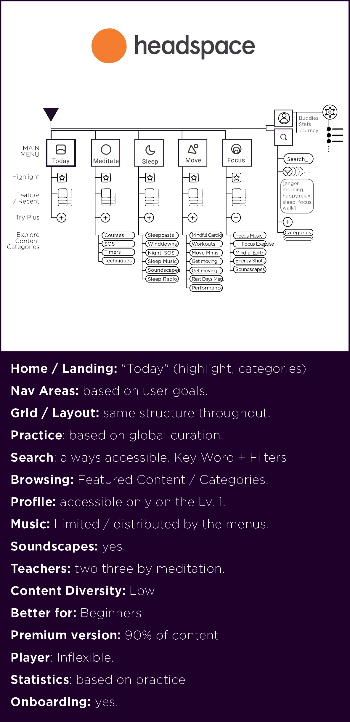
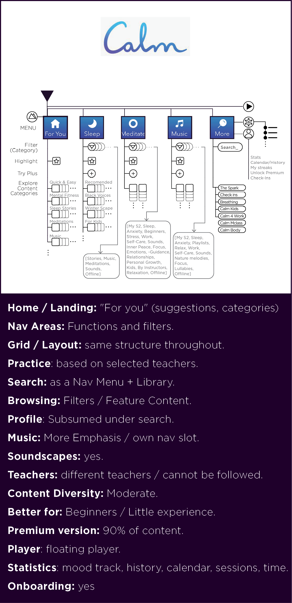
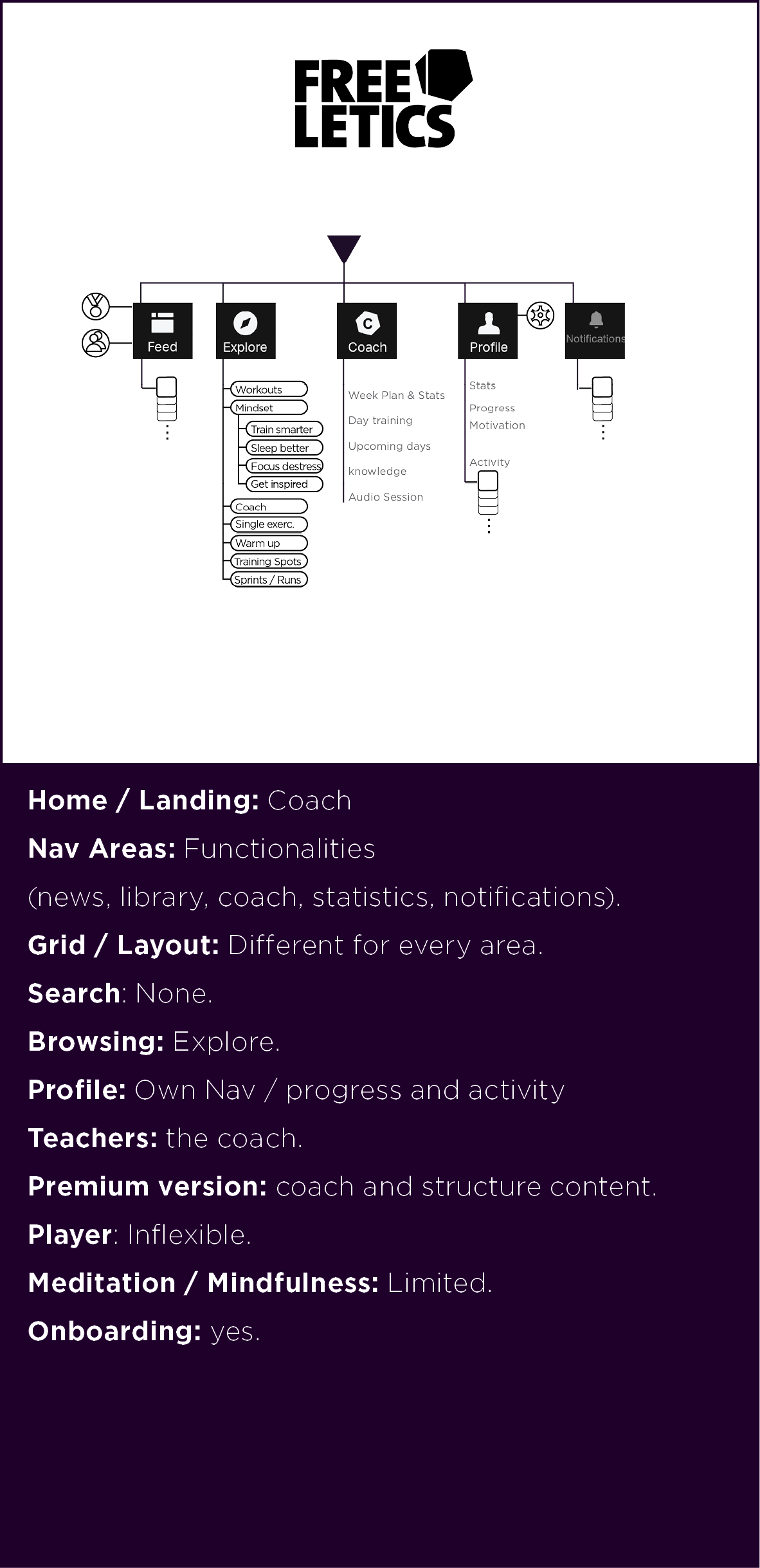
Method
Brief content audit (with especial attention to content structure), listing of features, and client reviews (youtube, app store).
Elucidation of choices
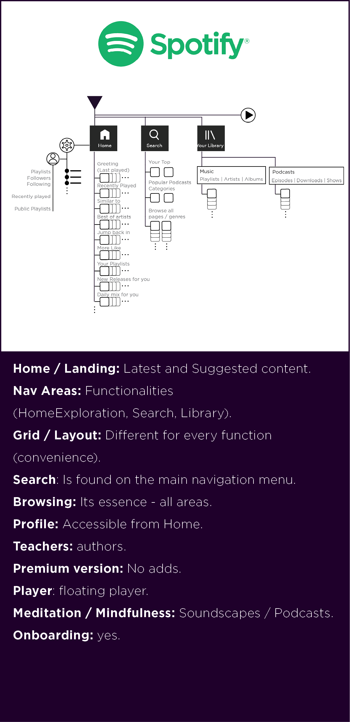
Not only competitors but other sites that provided audio visual streaming and a library of contents. Headspace and Calm was chosen for being the main name in the market. Freeletics has multimedia content, mind relaxation practices, and also teachers (Coach). Spotify is a popular streaming app with a vast catalog of content (its good design is notorious).
Outcomes
We acquired a critical repertoire of content organization strategies and a feel for trade for premium content. We could discuss and list key features. Moreover, it allowed us to be aware of specific questions and aspects to be further inquired in user interviews.
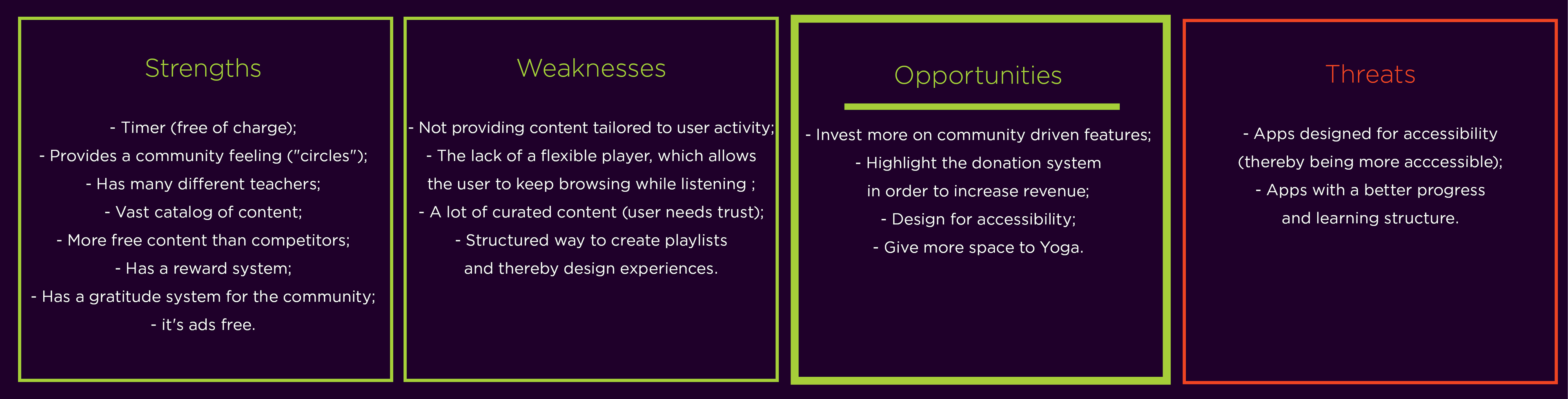
What makes Insight Timer unique
The timer functionality free of charge; The amount of free content; The rewarding of stars for meditated time; The amount of teachers and community feeling; Contents from all traditions and for all practices and benefits; The donation functionality.
E. Research | User and specialists reviews, desk research, interviews, insights

F. Brand filter - SWOT analysis
G. Requirements and strategy
• Creating a different narrative •
A. UX | User Stories, pain points, archetypes, tasks
Transforming research into narrative
Those narratives allowed us to determine some user archetypes and their goals and the tasks they want to perform (in the form of questions). Not forgetting some of the main pain points we discovered on the internet.

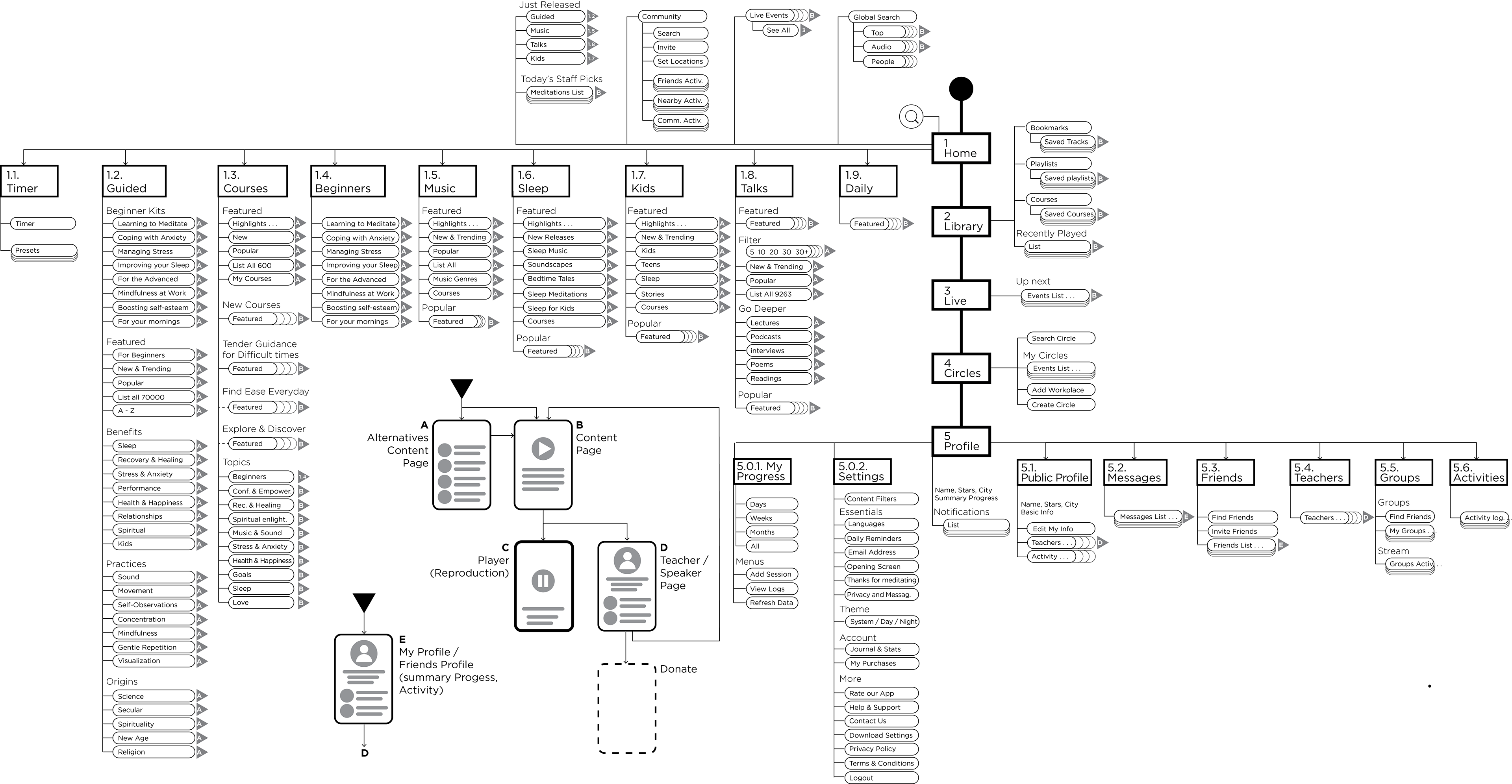
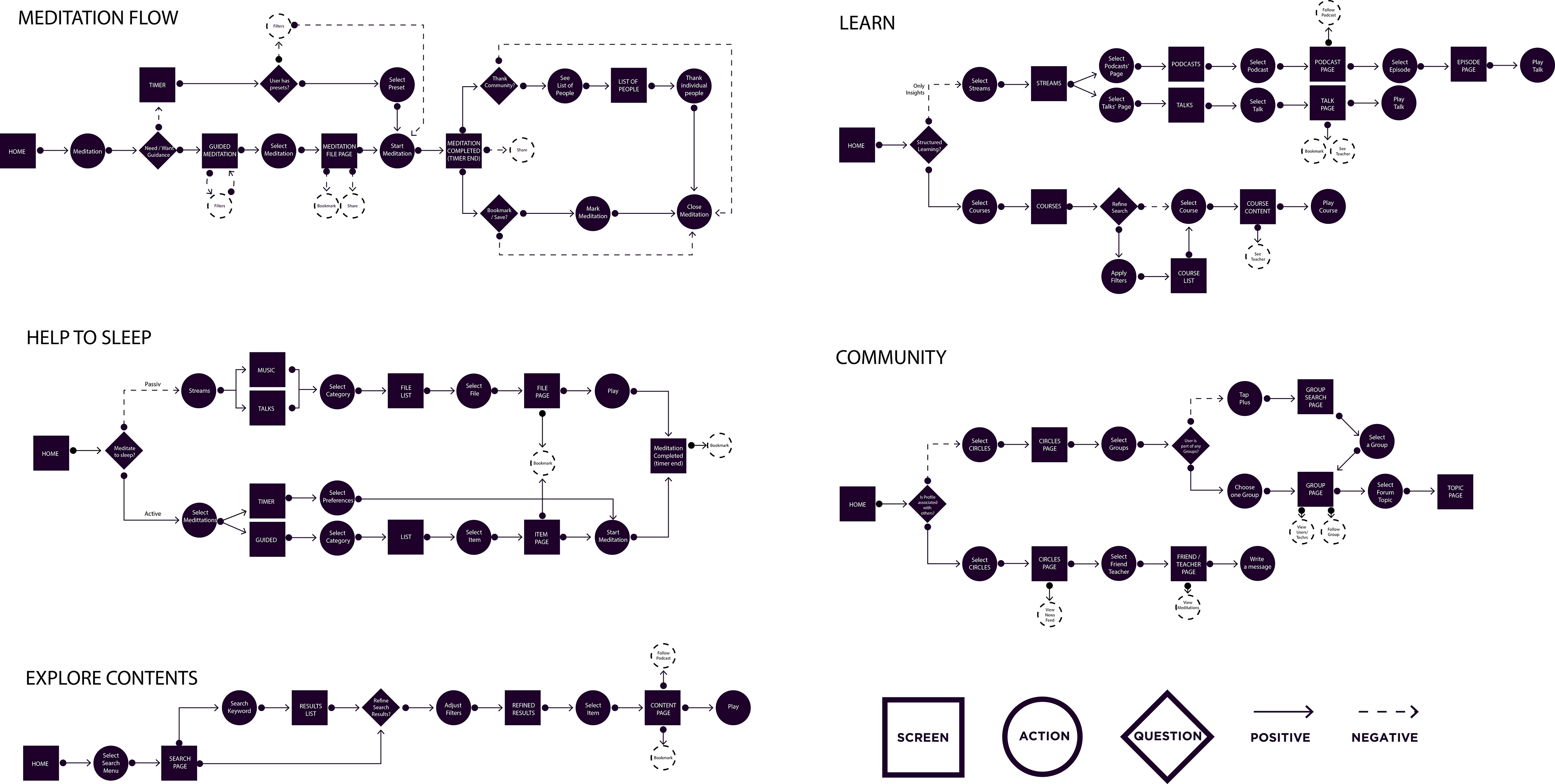
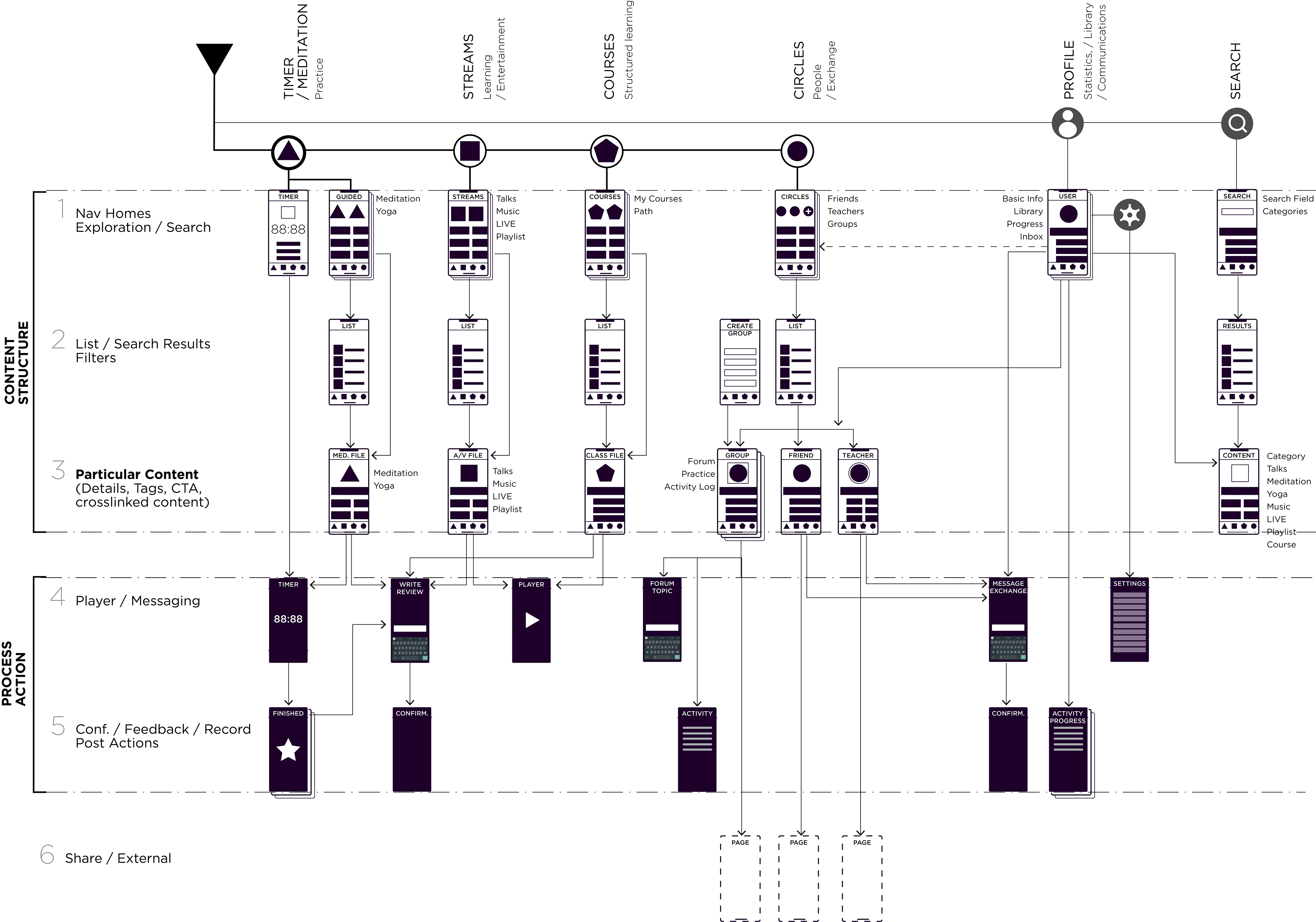
B. UX / Information Architecture
Flows with key actions and key frames
With the user tasks we could derive and detail task flows. After a couple of iterations, we could simplify some iterations and have a better idea of pages, main actions and content branches.
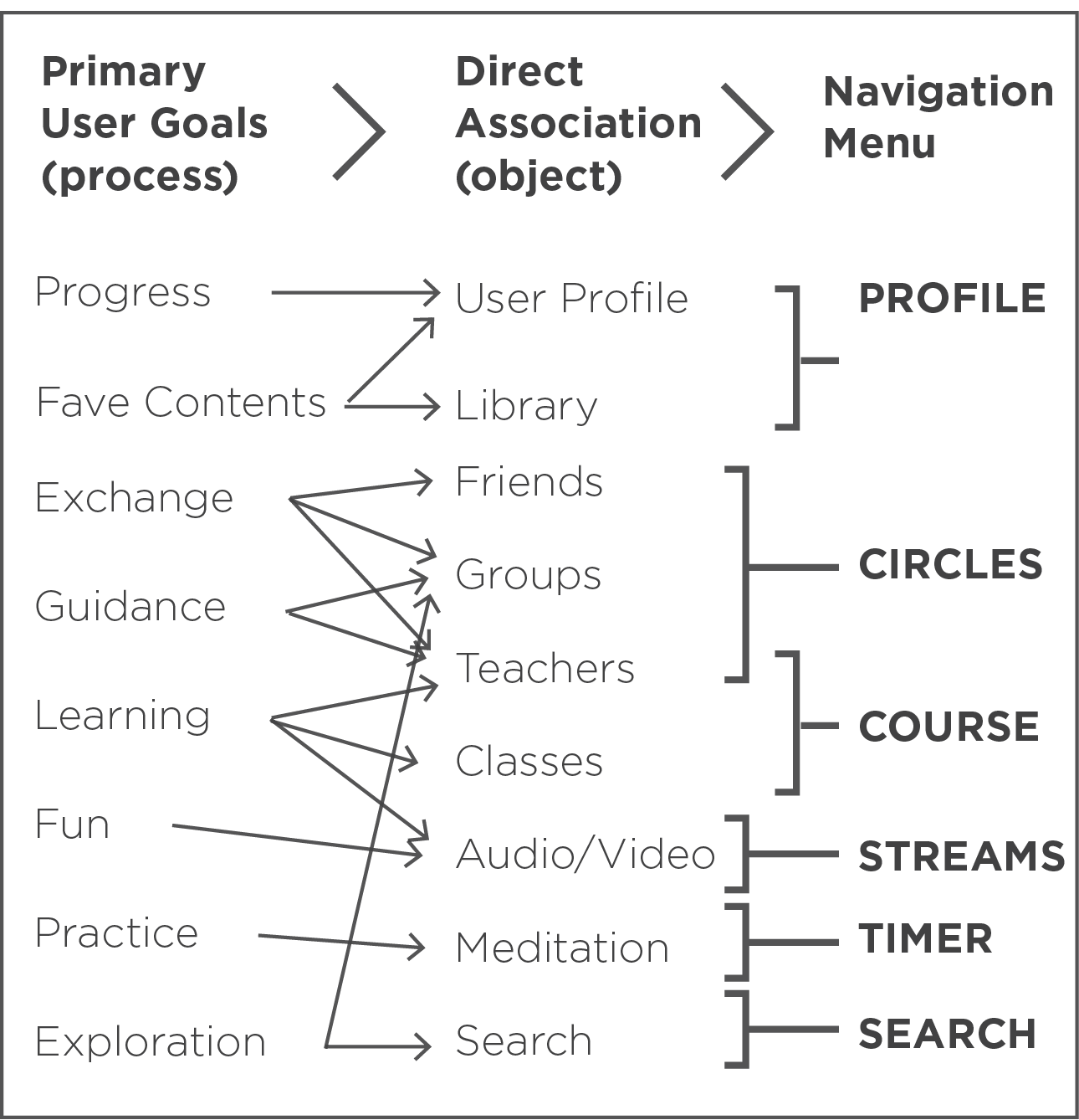
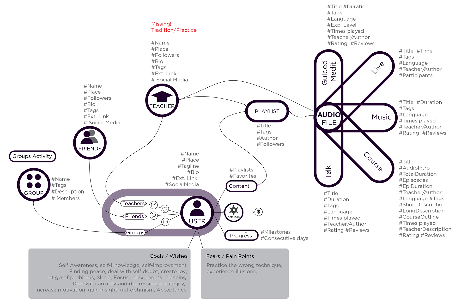
C. Detailing with OOUX [object oriented UX]
Going deeper we listed all the "OBJECTS" we had and their CORE CONTENT, the META DATA associated (not a main focus for our intents and purposes, but it is good to know), their connection to CROSS LINKED OBJECTS, and the ACTIONS they would offer. This is the result of 2 Iterations.

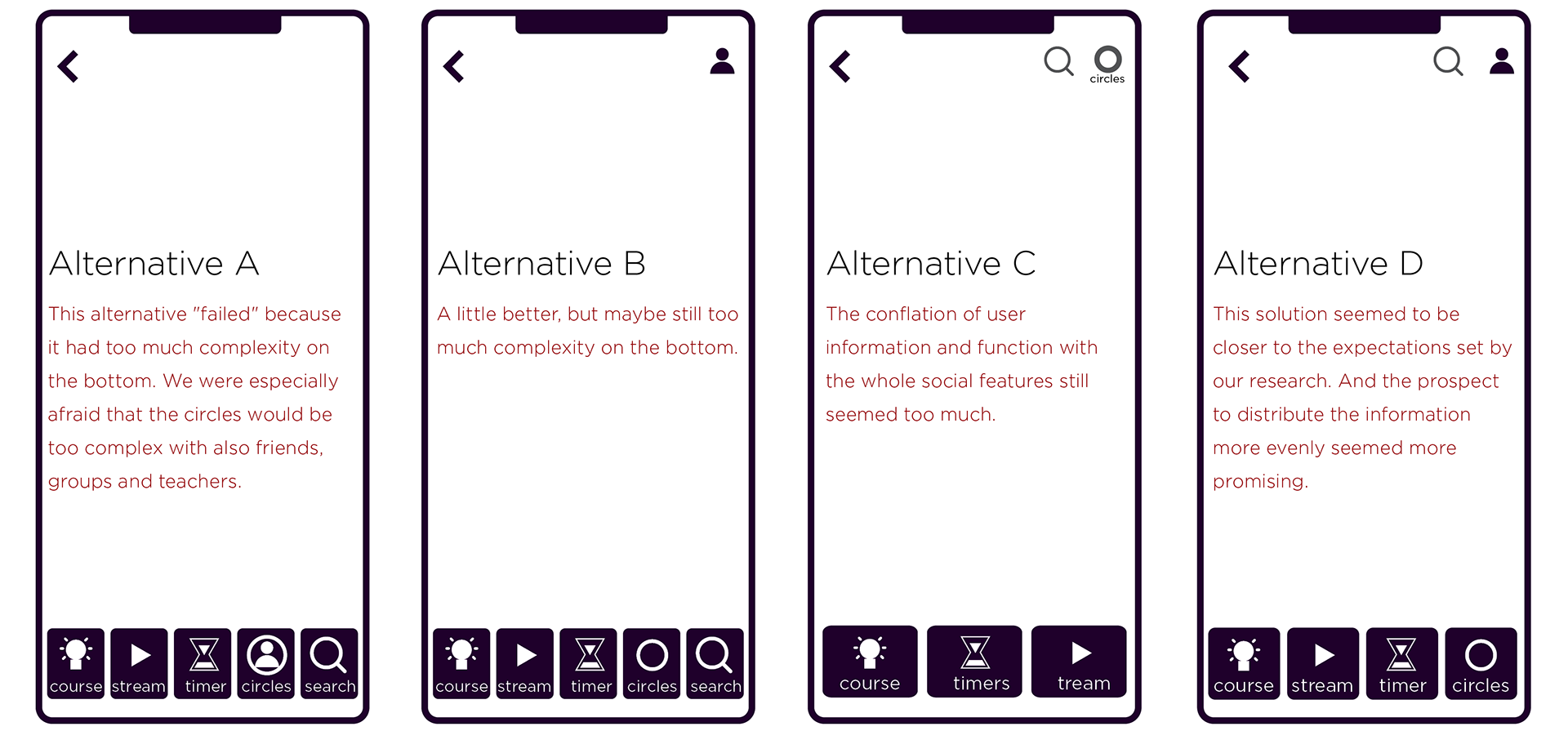
D. Sketching a navigation concept
The previous three steps allowed us to conceptualize some hypotheses for the navigation concept. After much deliberation we chose the alternative that would allow a more even distribution of information that makes sense semantically and corresponds more to "real world" conventions. Alternative D is closer to the final solution.
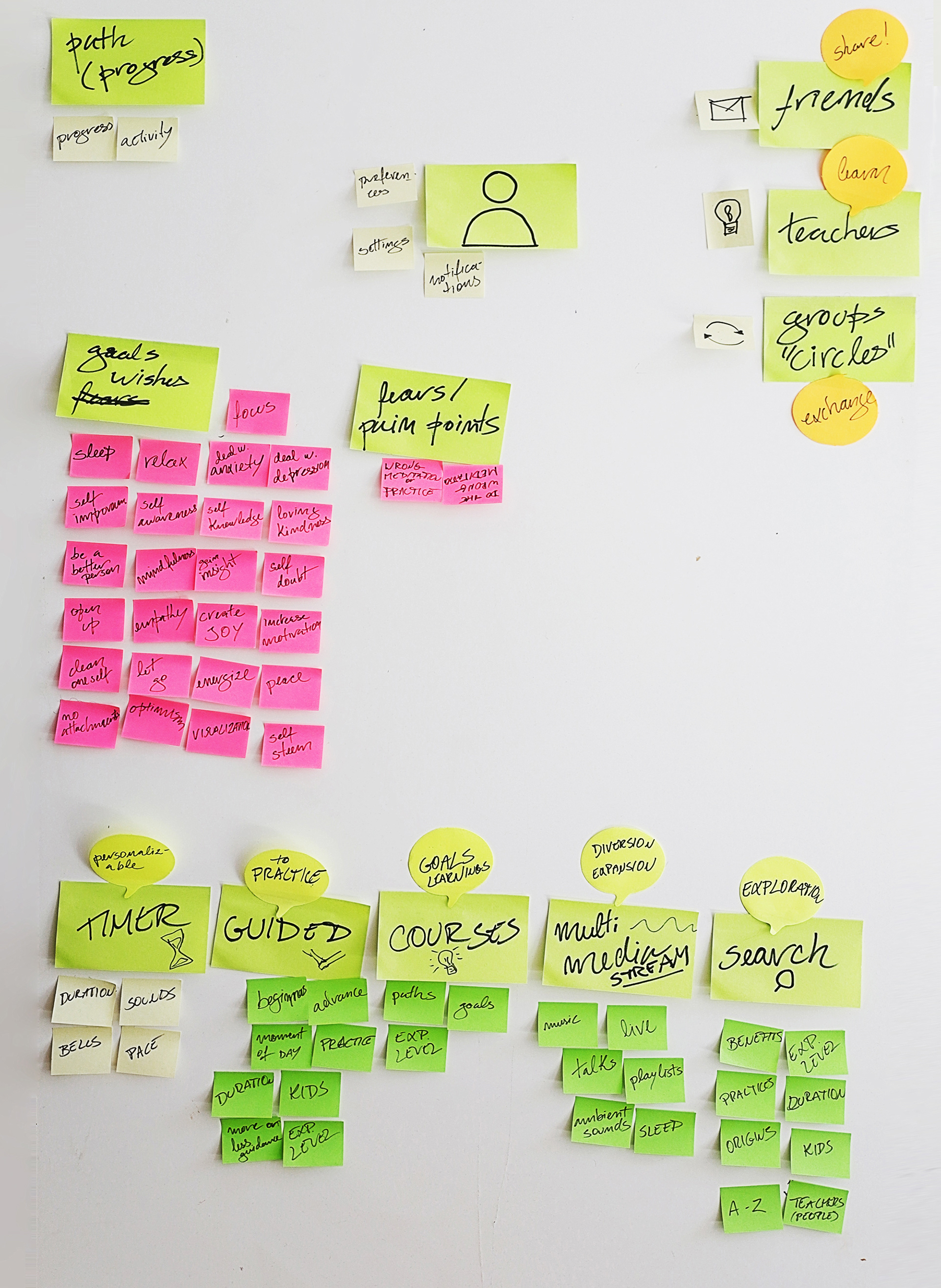
Mind Map
Mind Map
Sketches
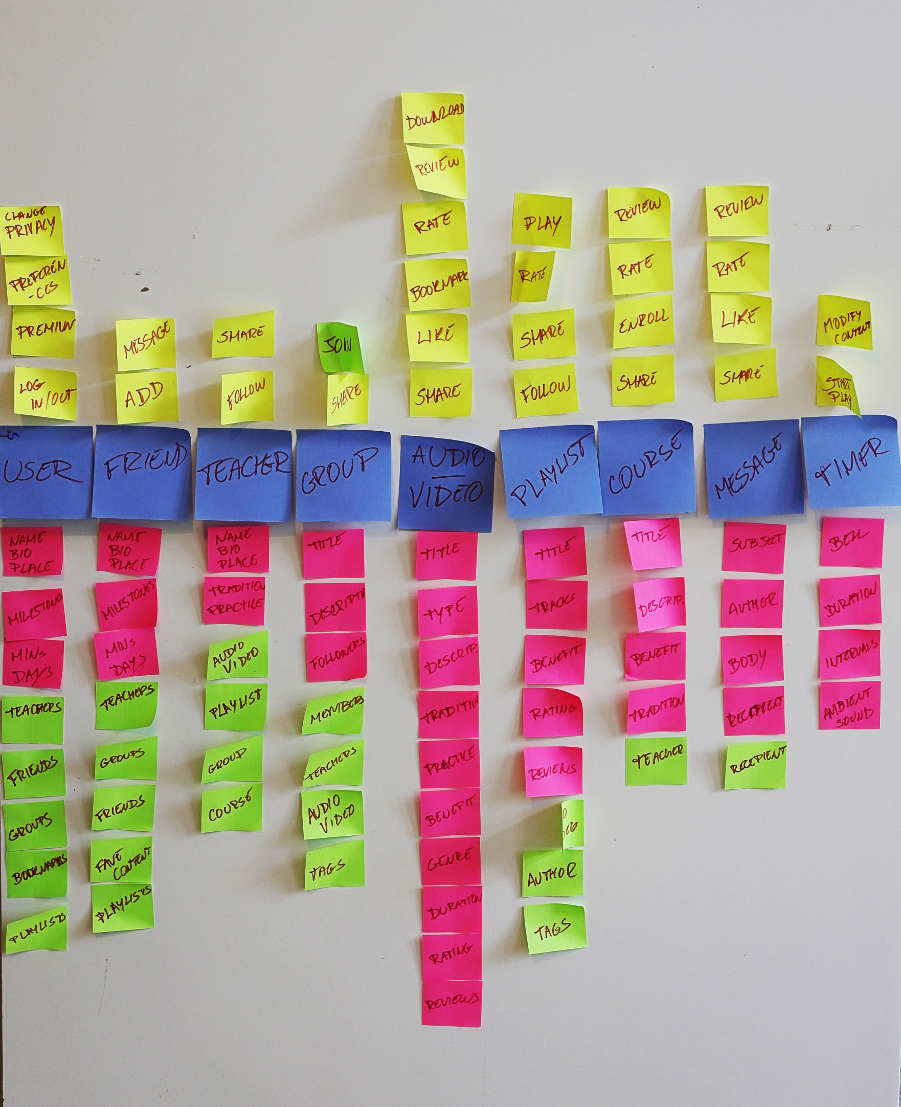
OOUX Matrix
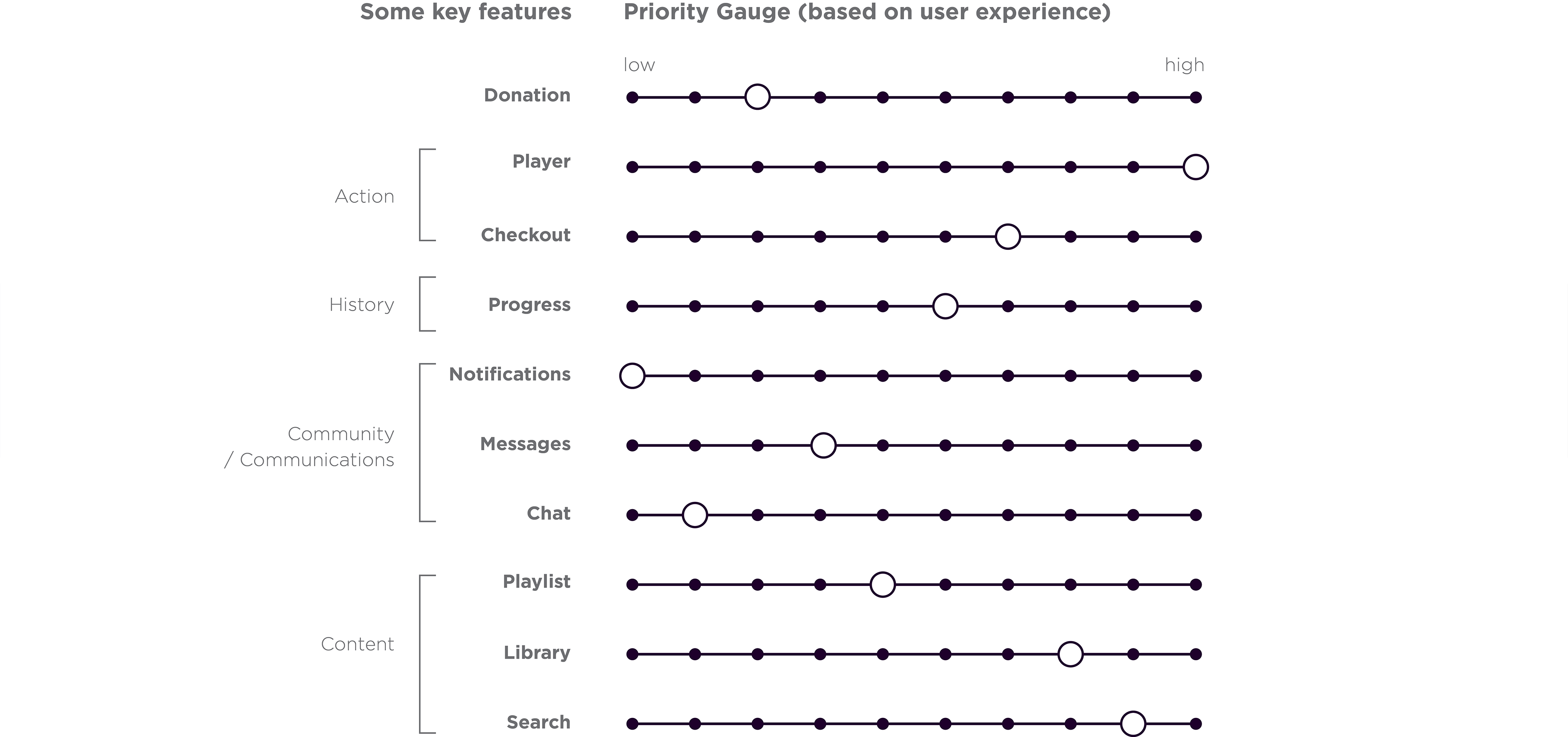
E. Features: Settings Priorities [trade-offs]
Preparing ourselves for the difficult decisions that were yet to come we used the the 'priority gauge' as a classification tool. We listed some of the main key features and discussed. Based on our research we gave priority to the features that would improve the user experience according to our interviews. The 'donation' feature, although placed low concerning UX is a feature that can be optimised in most places, without standing on the way of the main experience.
• Branding & UI •
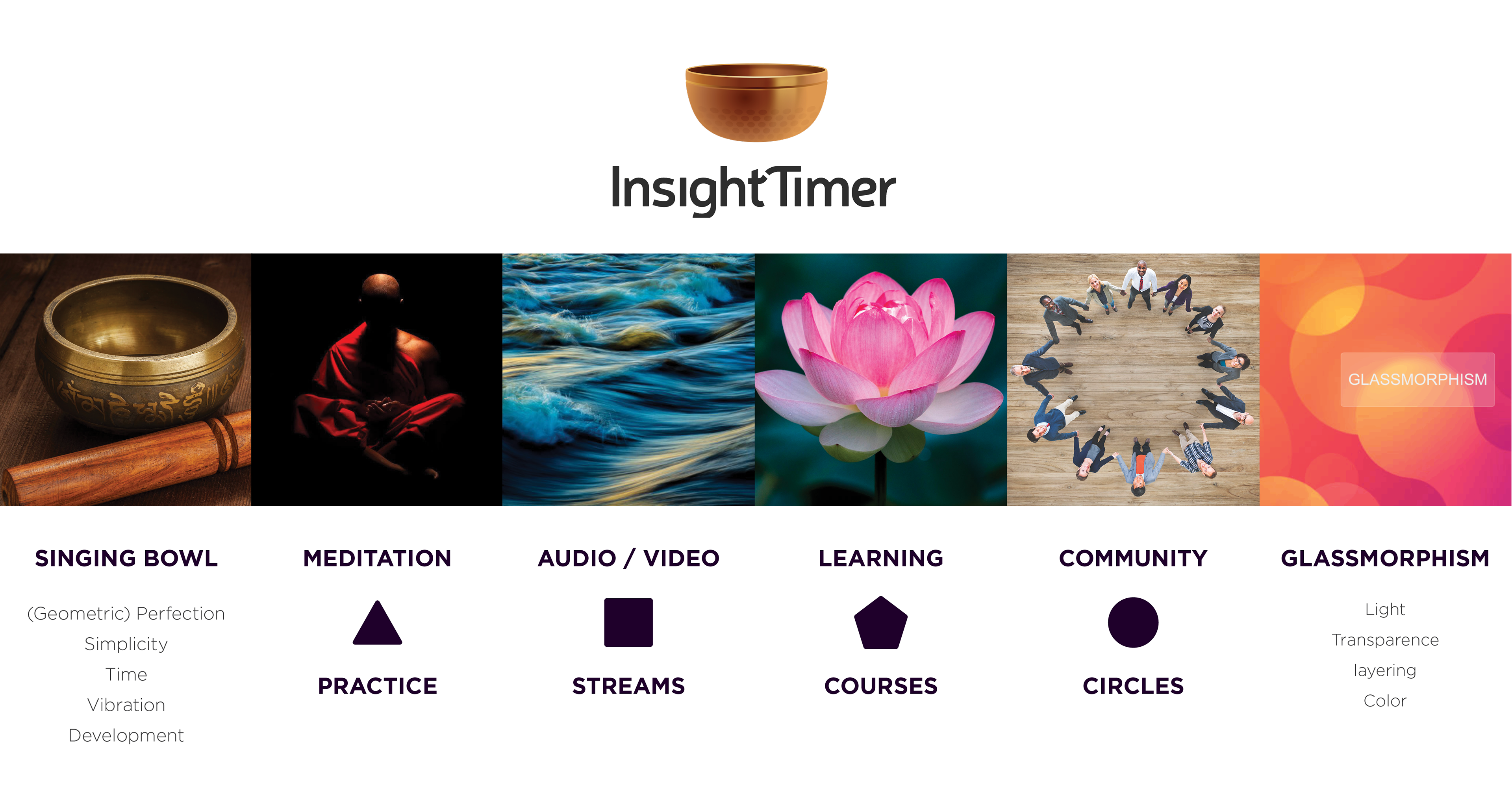
A. Moodboard and visual concept
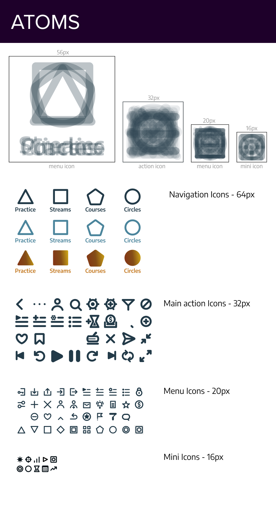
We put together a mood board with images and words that not only represent the brand but also the activities in the app. This was the departure to finding out the symbols and icons. As a visual hypothesis geometric shapes would be the best abstractions in order to represent the main functions, but also it would be a solution that would help with recognition of the content by a vast range of users. Glassmorphism is a trend that seemed to us to be a good metaphor and starting point for the concepts we intended to communicate.
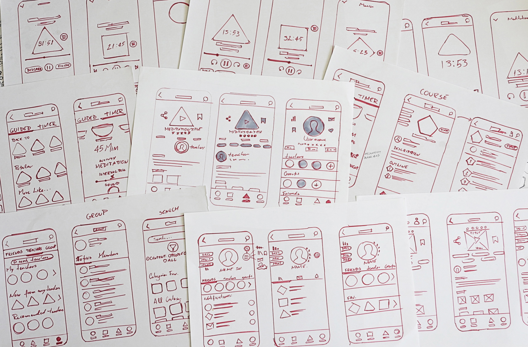
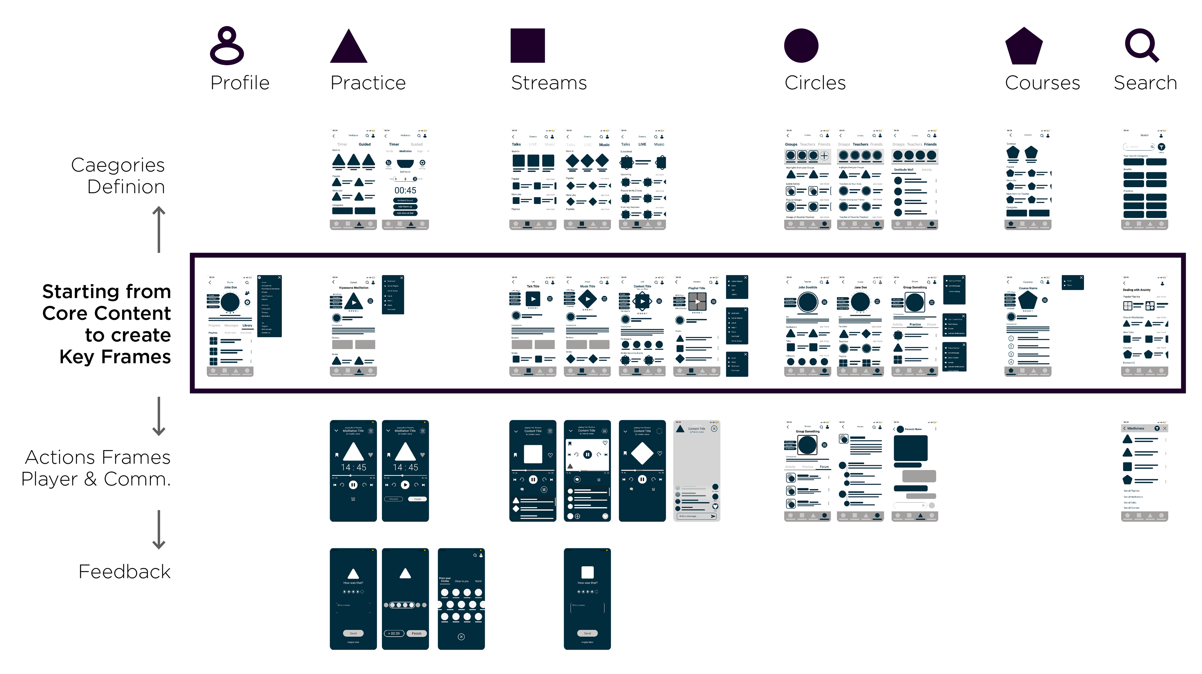
B. Low fidelity wireframes (Figma)
The strategy was to design the core pages and then go one level up and one down, in order to define the home pages and the actions respectively.
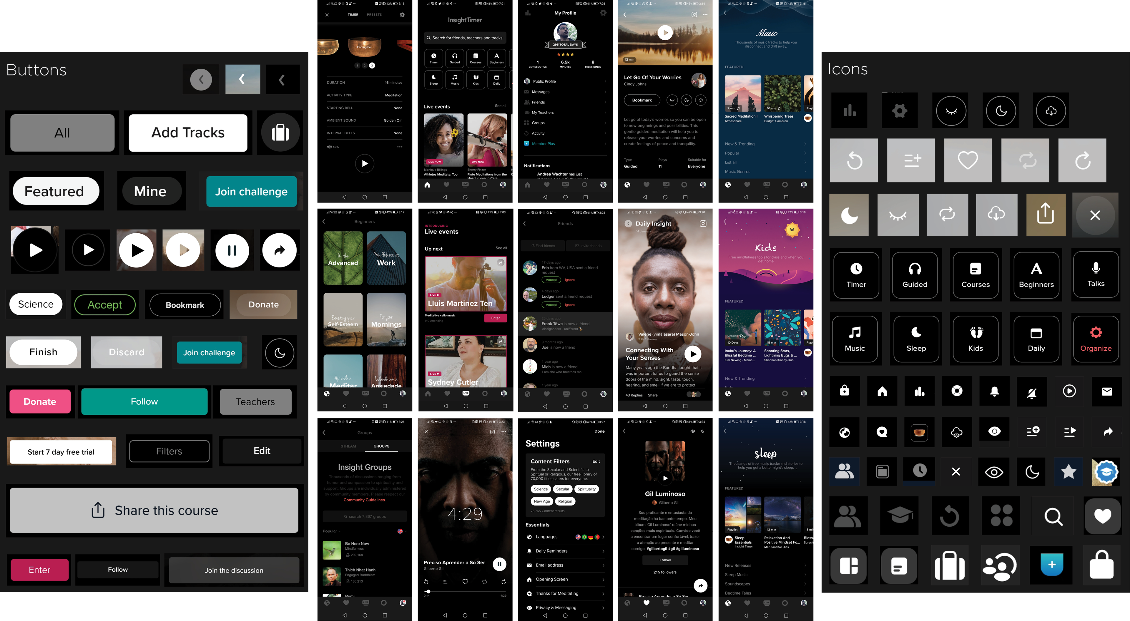
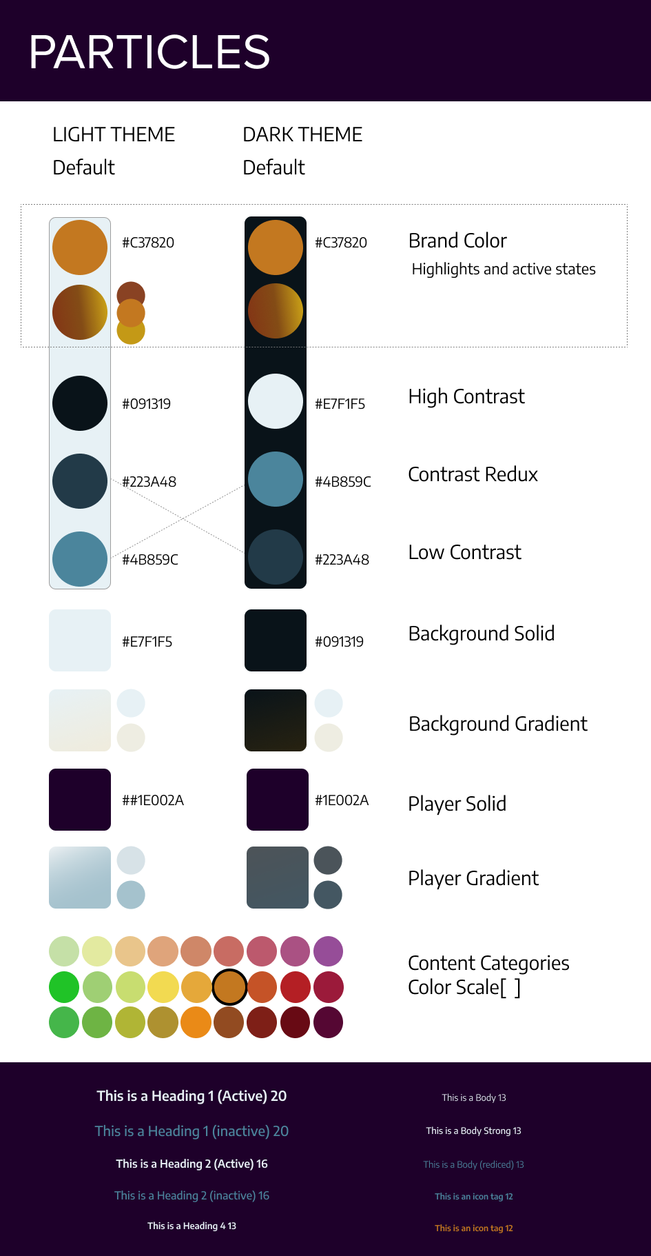
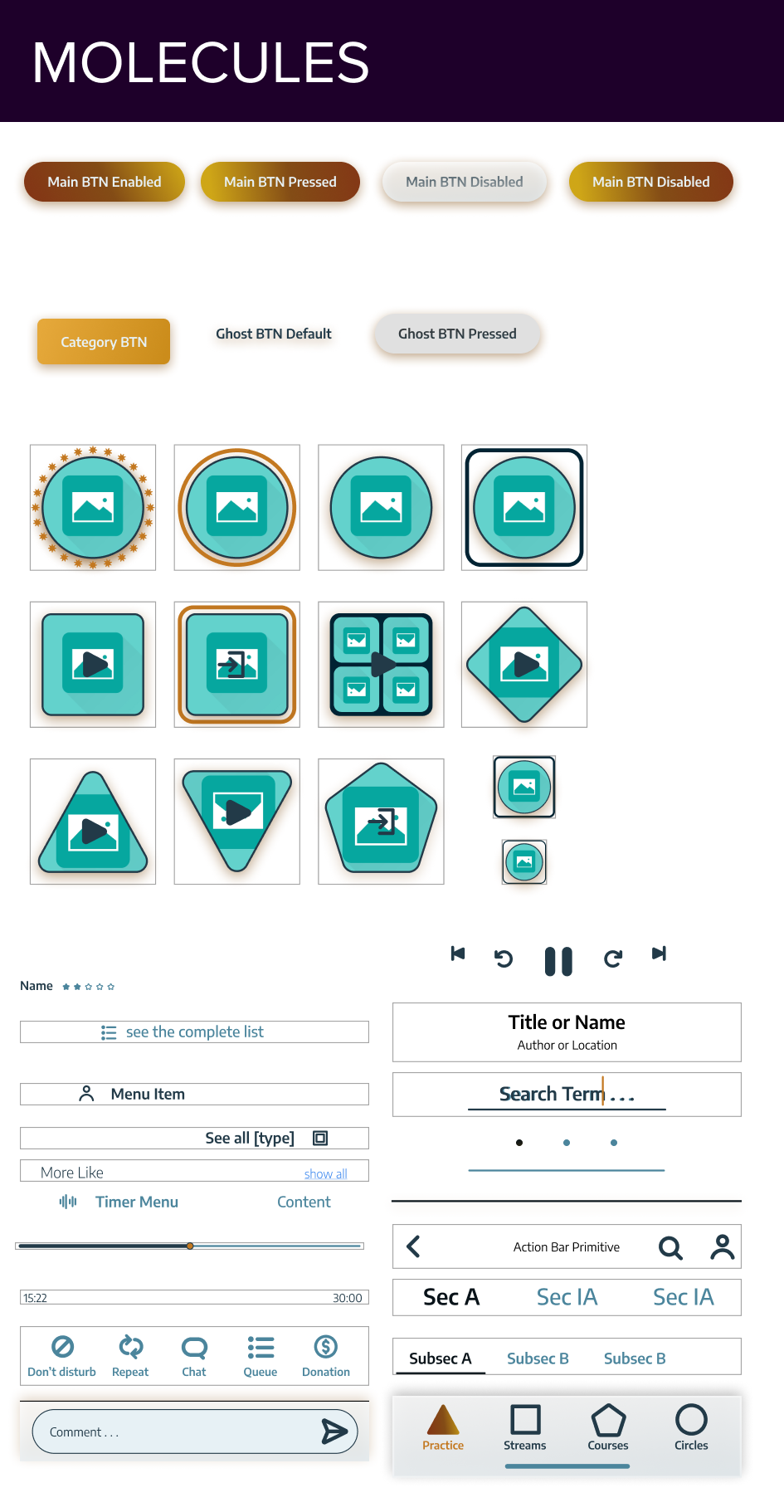
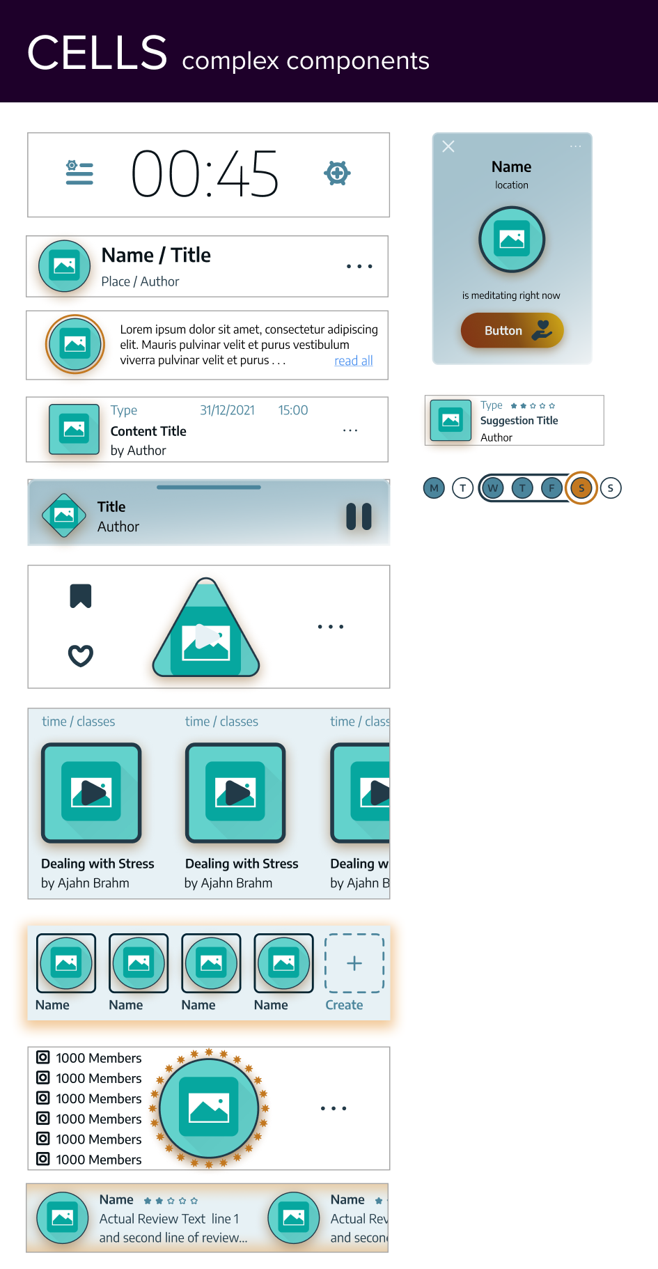
C. Styleguide and components (atomic design approach)
The low fidelity made possible to make a list of the necessary components. An atomic design approach was used to optimize this process. The colors were chosen to achieve maximum contrast; the icons follow the same geometric principle, everything with rounded corners.
D. UX / UI | User flow / Content map
E. UI - High fidelity wire frames
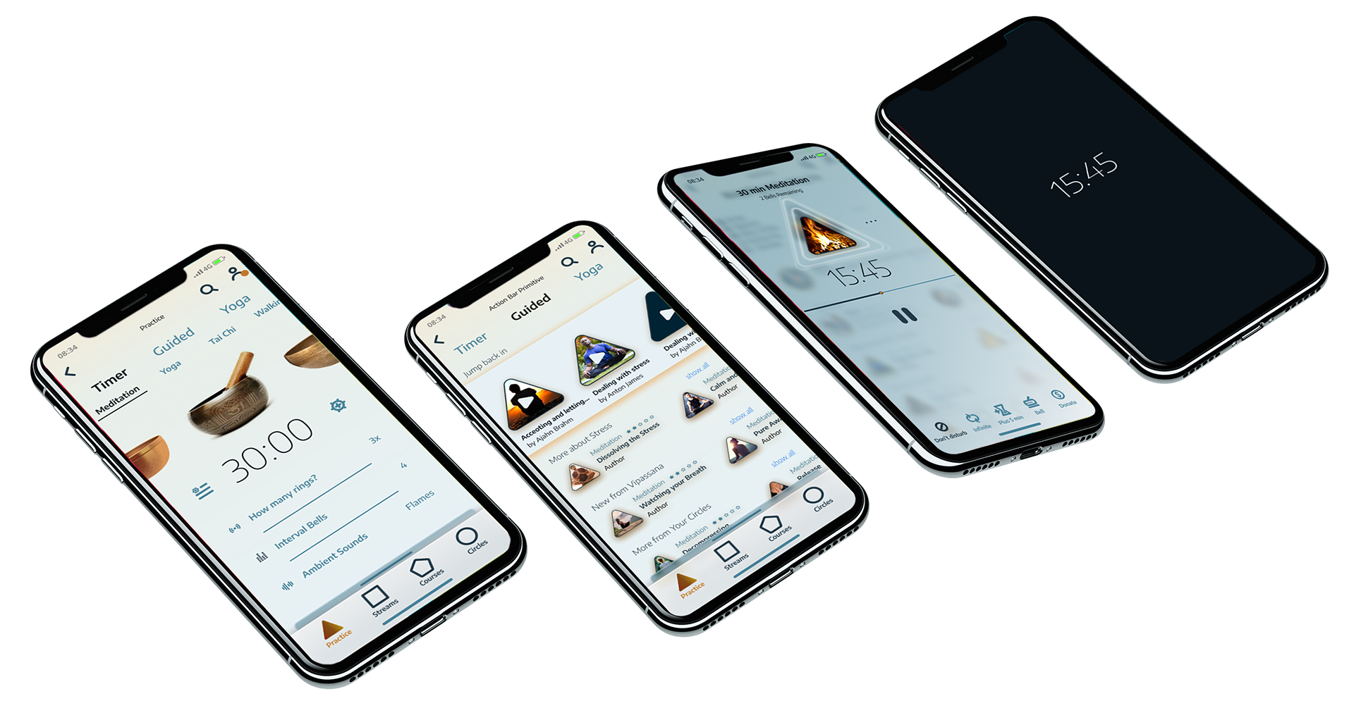
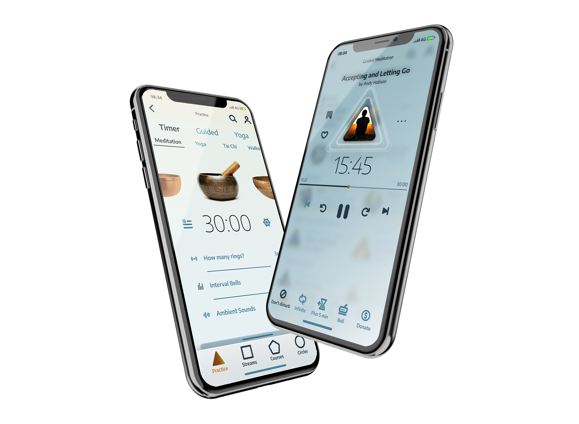
Landing into Practice
Ready to meditate with
or without guidance and offering short cuts to the latest reproduced meditations and suggestions of new content.
or without guidance and offering short cuts to the latest reproduced meditations and suggestions of new content.
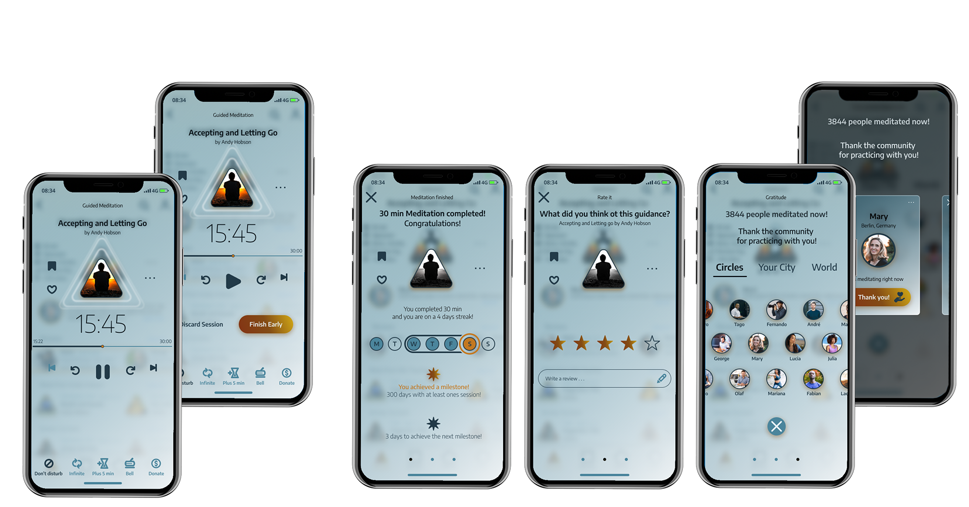
Giving Gratitude
After practicing with the timer, guided meditation or yoga, the users achieve milestones, gives feedback,
and exchange gratitude for their practice.
and exchange gratitude for their practice.
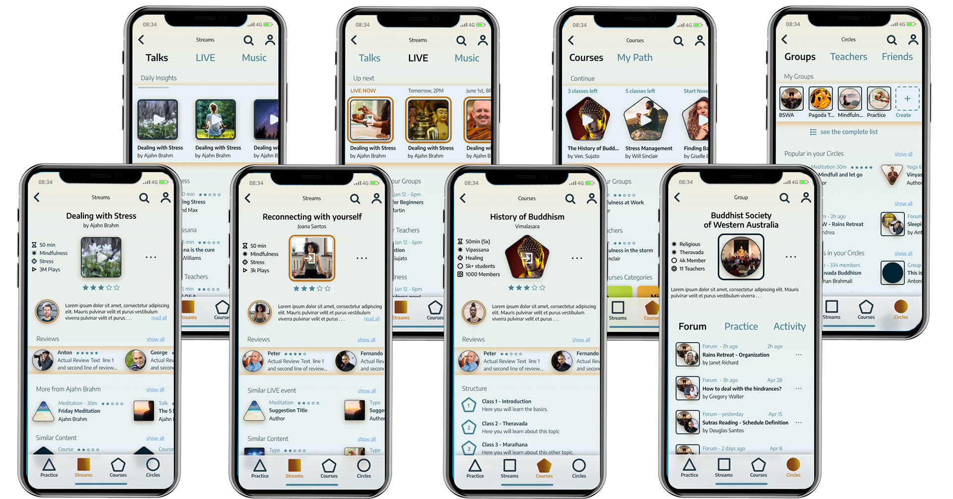
Suggestions
Community reviews and cross-linked content on specific content pages.

Search categories
The page is updated in real time with relevant content.
The user can choose the suggested content, a category, type or the whole content related to the keyword.
The user can choose the suggested content, a category, type or the whole content related to the keyword.

Player
Not only specific functions to the kind of media (practice, talk, video, live streams, courses) but offer features to interact with the community (chatting, making donation, sharing, forming groups, and so on).
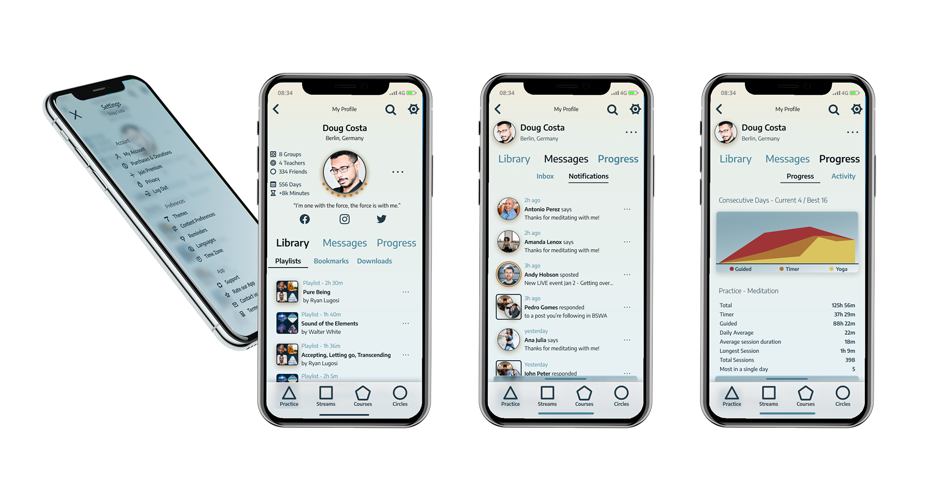
Profile / dashboard
Progress and statistics, library with playlists and bookmarks, messaging and notification, progress and statistics, as well as of course the setting of preferences.
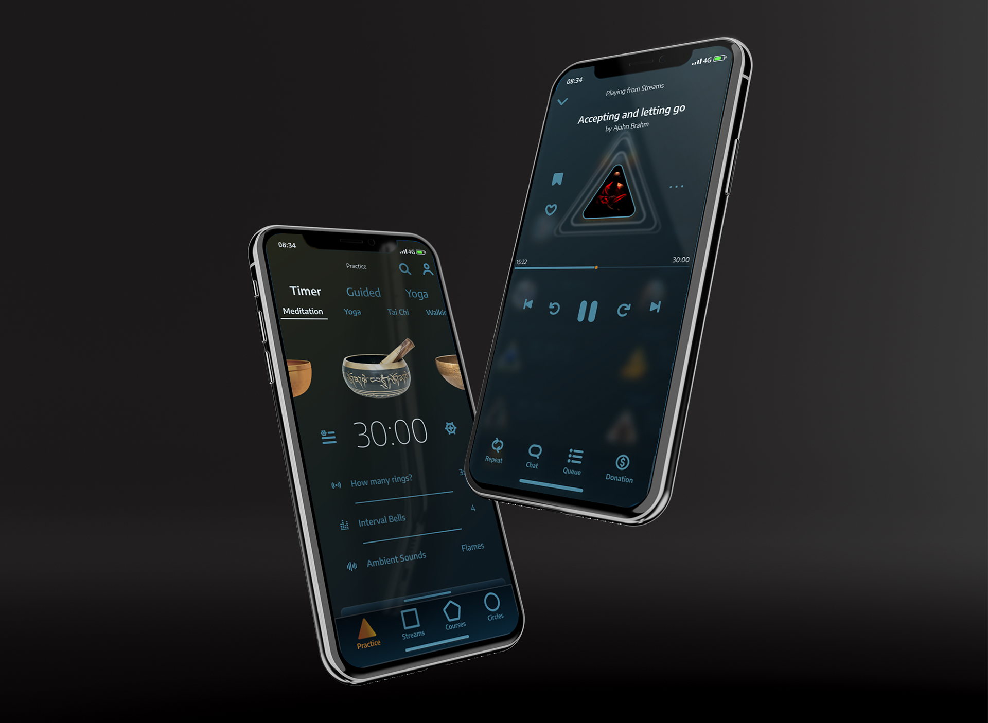
dark mode
- TEAM'S Assessment -
How could we go from here?
With more time we would like to address all accessibility and interactive aspects of this experience. First, one more iteration for the player's flow design would be necessary.
In order to do that, usability tests would be necessary (e.g. A/B testing). To be discovered would be especially: if the flows generated in fact represent the smoothest path possible, the player concept reception, the donation feature reception, and if content and feature hierarchy translate to a more expressive number of users.
In order to do that, usability tests would be necessary (e.g. A/B testing). To be discovered would be especially: if the flows generated in fact represent the smoothest path possible, the player concept reception, the donation feature reception, and if content and feature hierarchy translate to a more expressive number of users.
Furthermore access to actual metrics would help to identify bigger sources of error and statistics.
Also, we strongly believe that a proper on-boarding experience would help generating content pre-filtering. This would have to be designed next.
Disclaimer
This was an unsolicited redesign and, as such, is probably lacking some of the specificities about the business and technical contexts. Besides the user experience, we were sure to take measures to improve revenue. As one can see online, revenue is generated through some percentage of the donations to the teachers, courses and with a subscription, which unlocks online features. In the presented solution, the course's section not only gains more prominence, but the donation feature gains prominence.