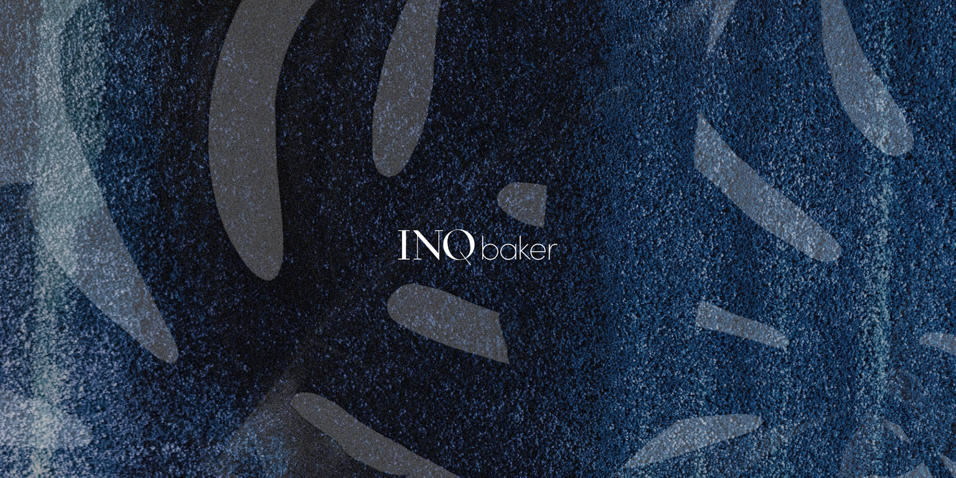
Context & Challenge
INQbaker (a business incubator) had a first concept for its brand identity (serious, and yet hip). However, the logo was not ready for all the challenges a fully functional identity had to fulfil. The identity wasn't readable in very small sizes (e.g. Favicon) and had to be used for the plurality of goals and be able to speak to a diversity of people (from investors to talents, from startups to people searching for a co-working space). A color coding was already starting to be implemented. It lacked the necessary systematisation.
Strategy & Roles
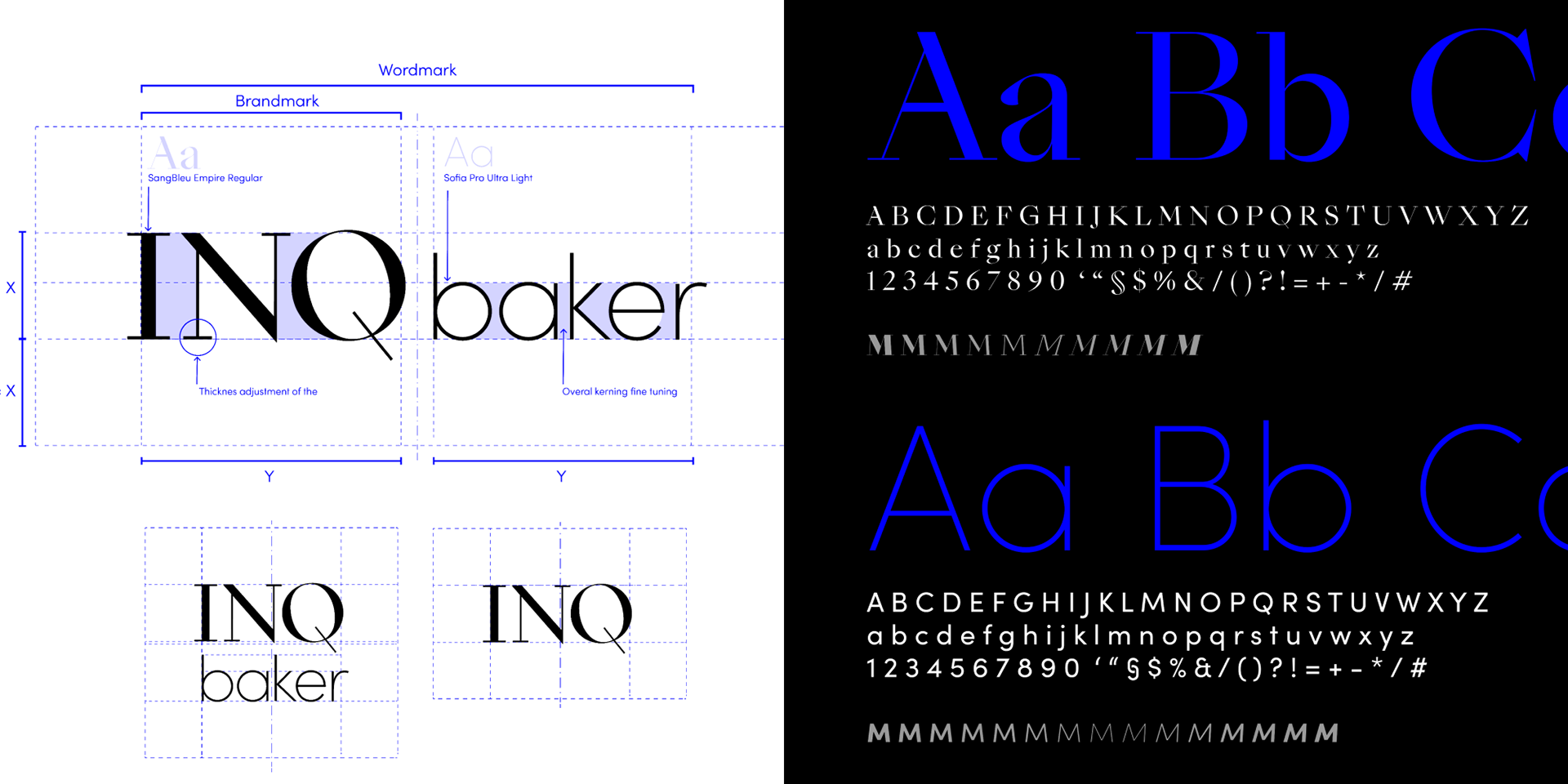
Communication: Translate the core values into a functional graphic system. Technical fixes: Kerning, definition of minimum size, stroke thickness adjustments for readability. Process: As a team lead, besides systematising the brand guide, I supported the team directing the creation of different communication pieces and templates for internal and external communication materials.
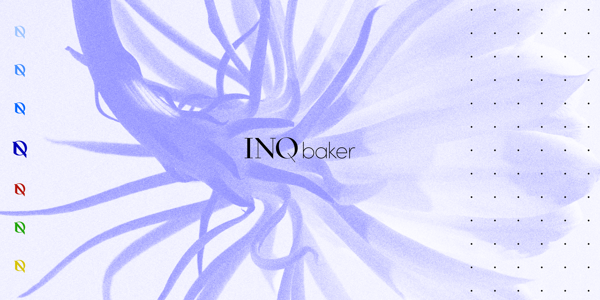
Monogram: The typographic logo as well the specific typography used represented a special challenge. The strategy was the creation of a monogram based on the 'I,' 'N,' and 'Q' letters, to be used only on very special cases, which would render the main logo unreadable. It was up to me, to design it.
Team:
Douglas Costa (team lead, art direction),
Suna Basaran and Rona Mulgar (graphic designers), Gianluca (concept).
Moodboard

Logo Architecture

Color and Type Scales
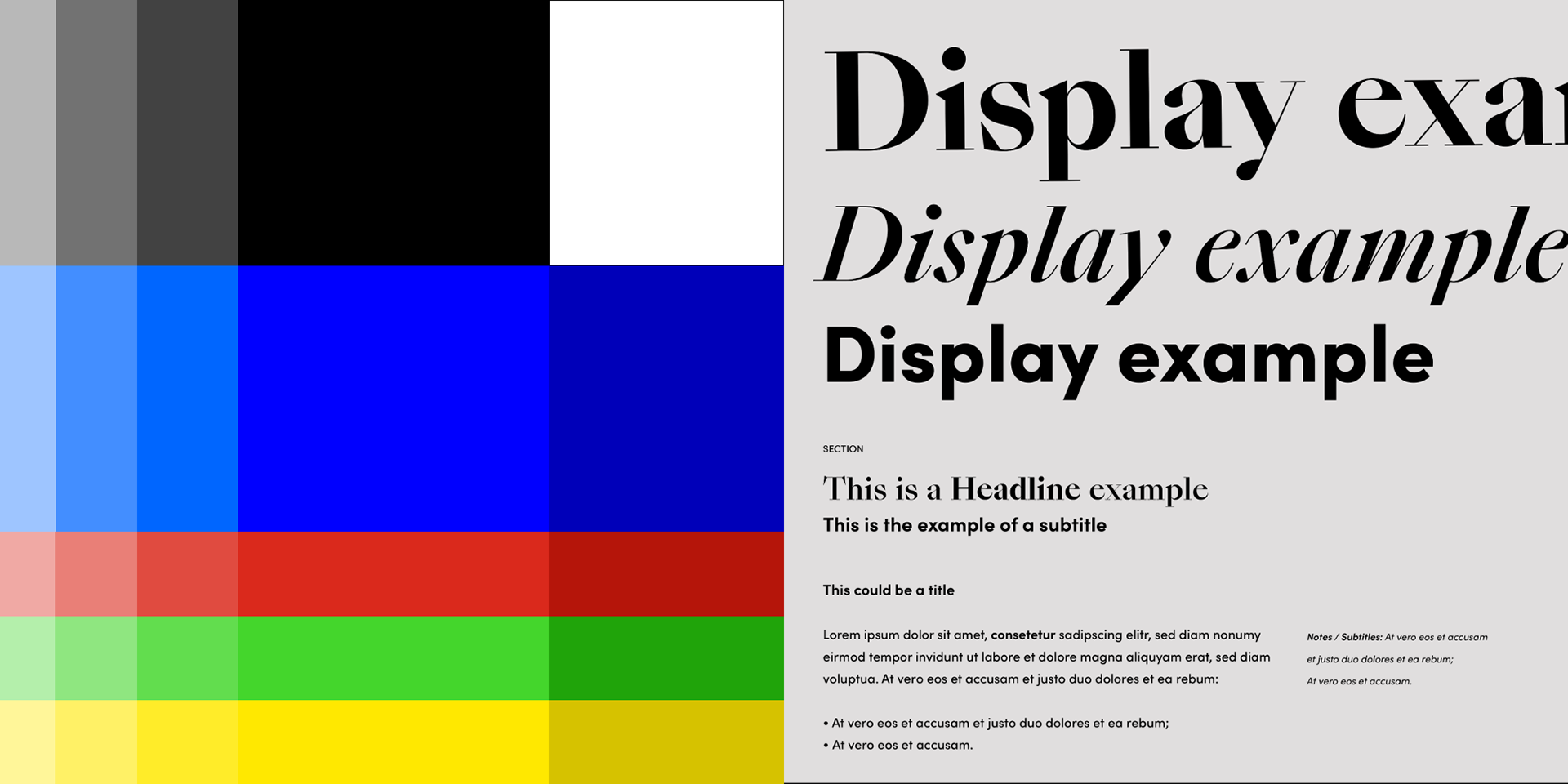
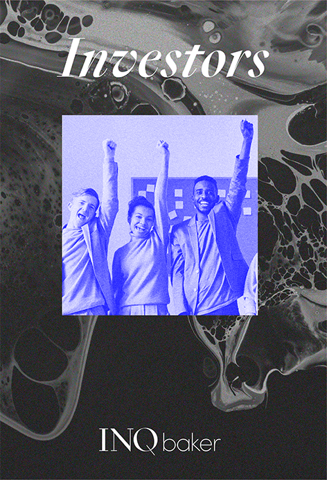
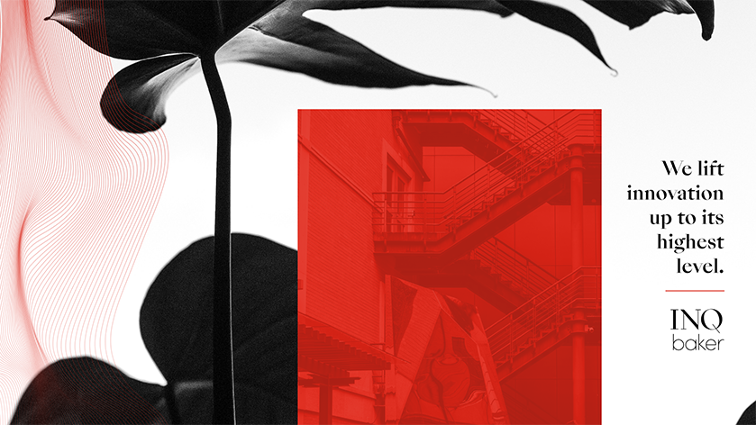
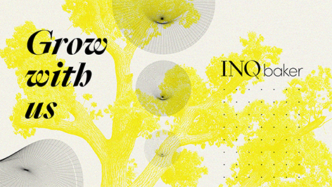
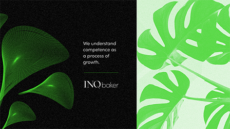
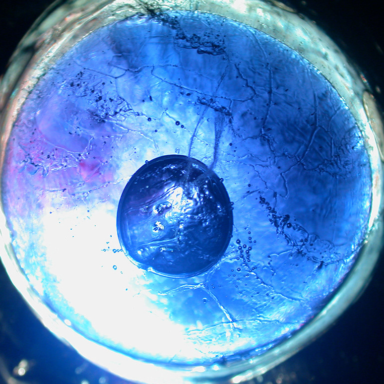
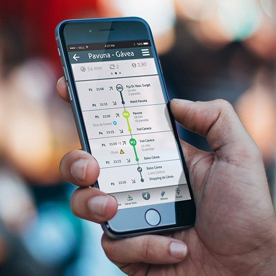
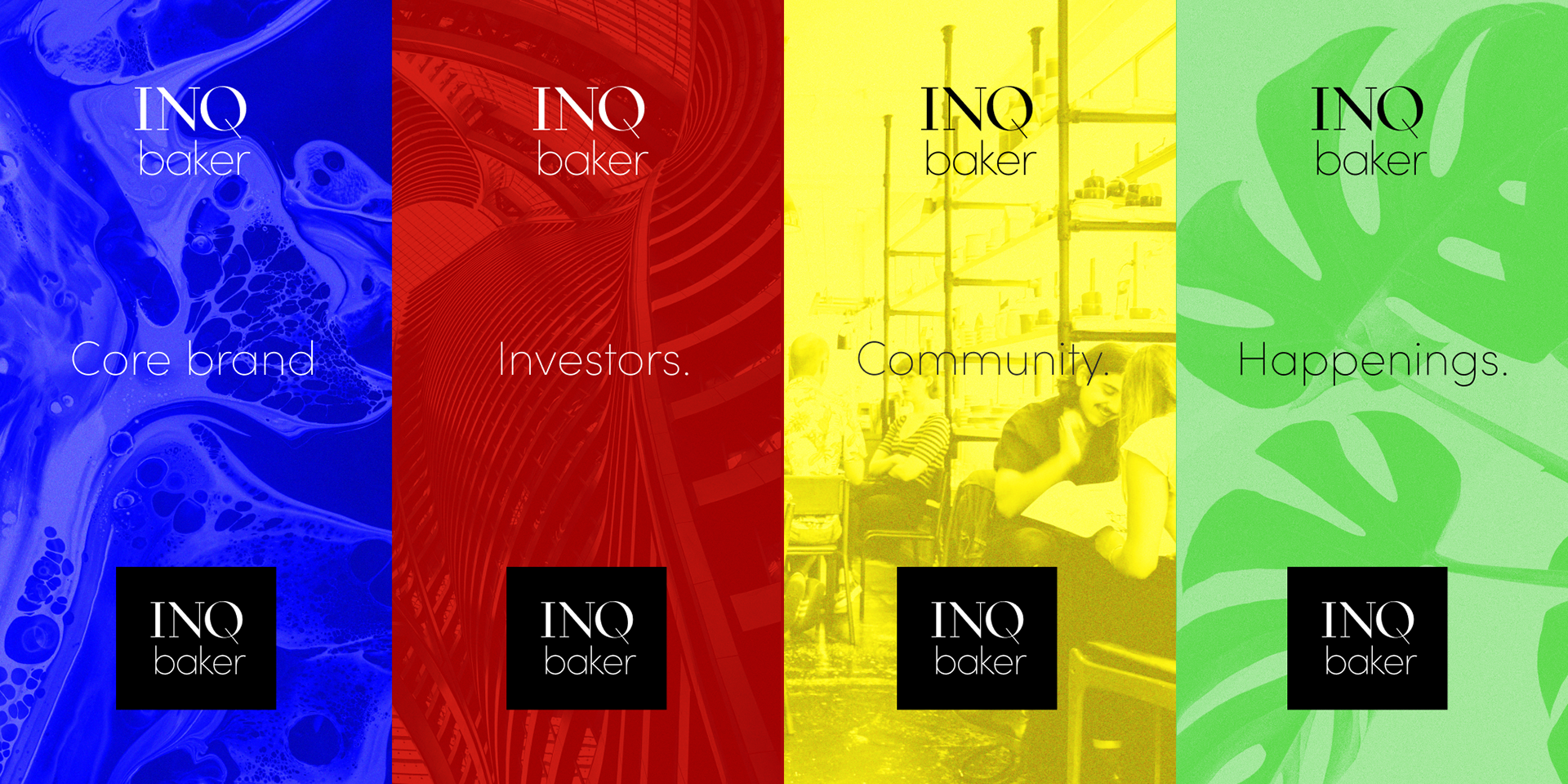
Image World and Sub-brands
Monogram / Favicon


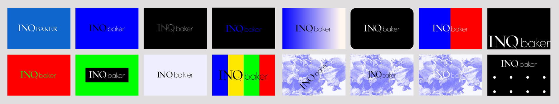
Incorrect uses
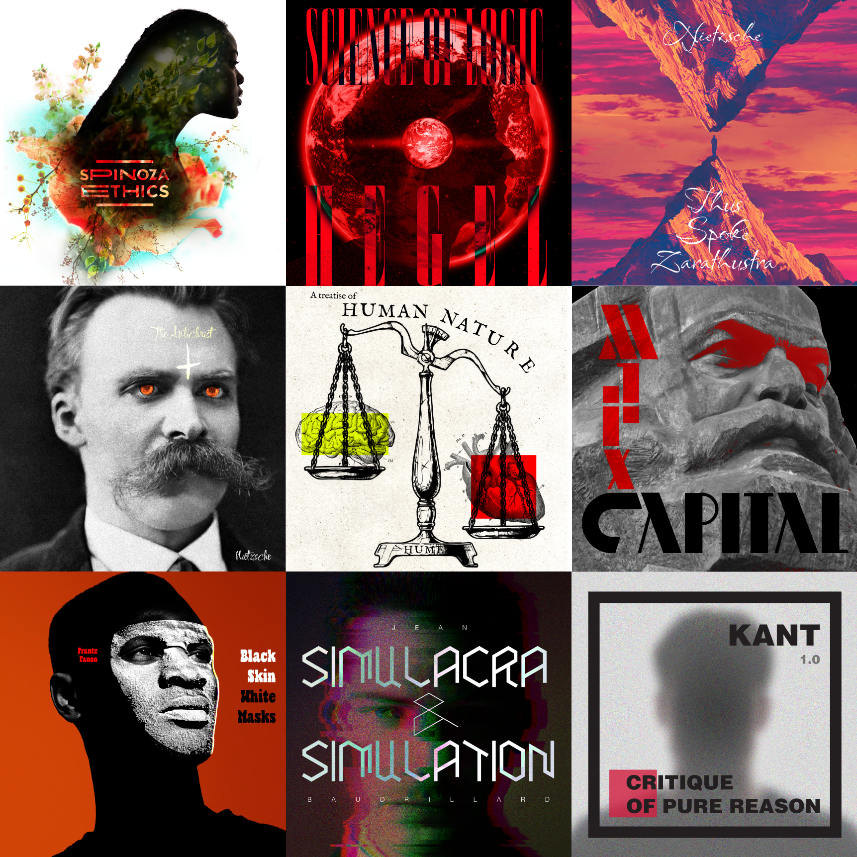
Graphic Material Overview
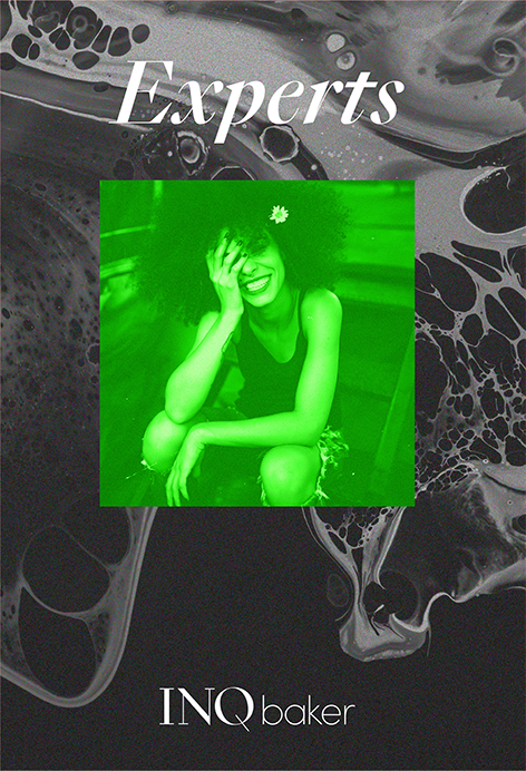
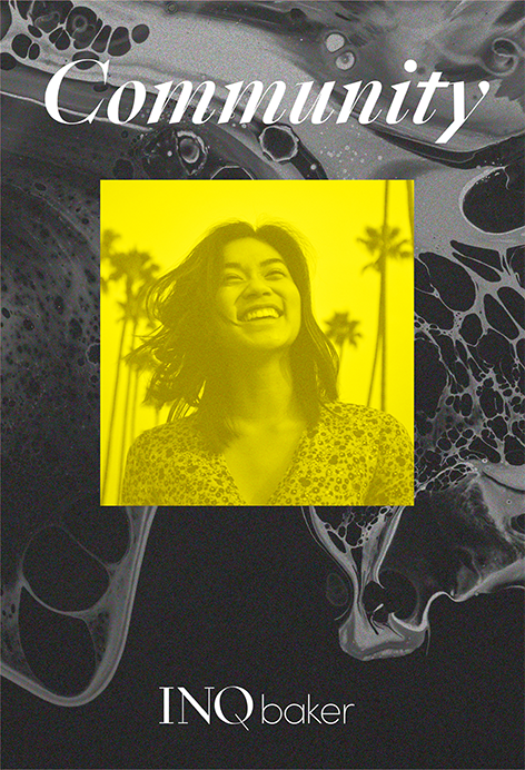
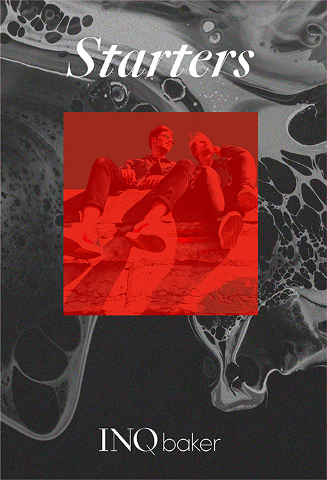
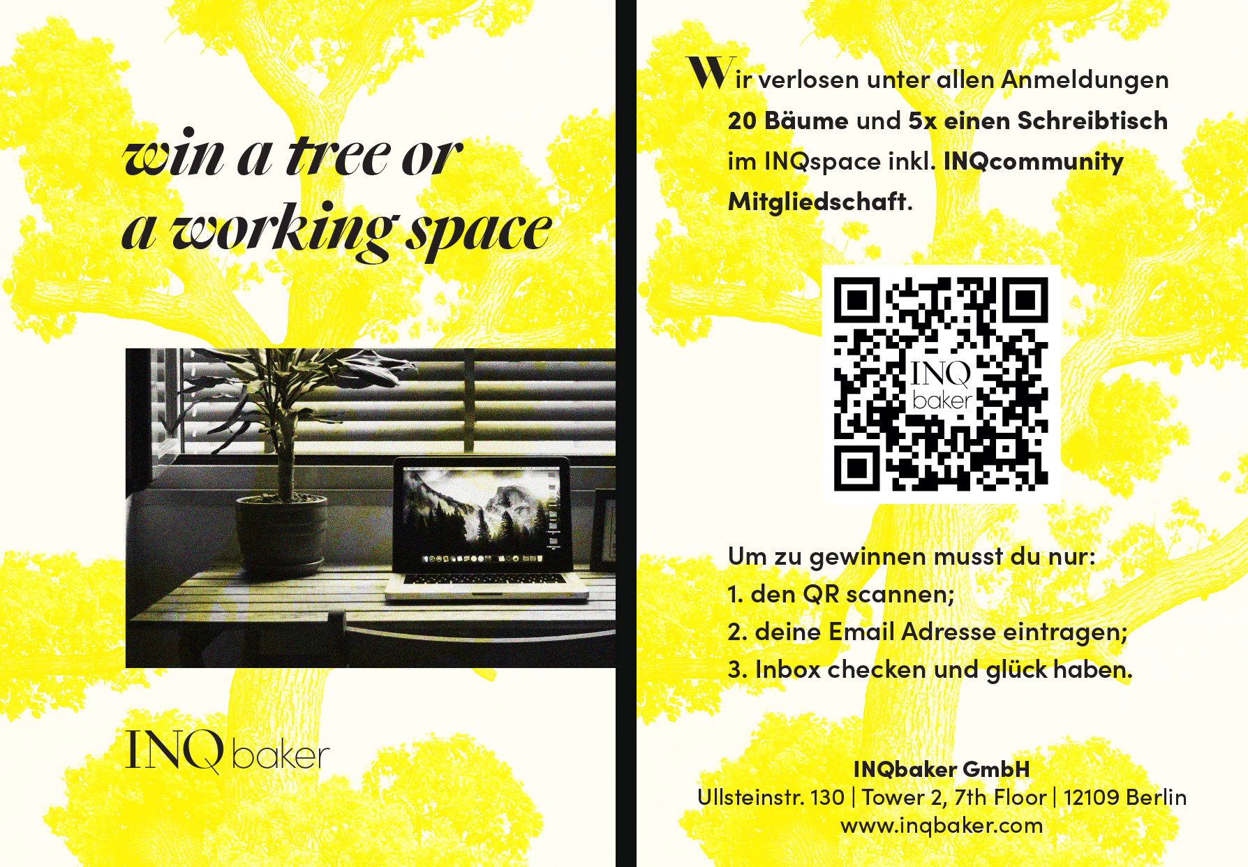
It was proposed to the team to develop graphic material that would tell the brand's story.
The goal was to test the limits of the graphical system. Here are some of this output.