Context
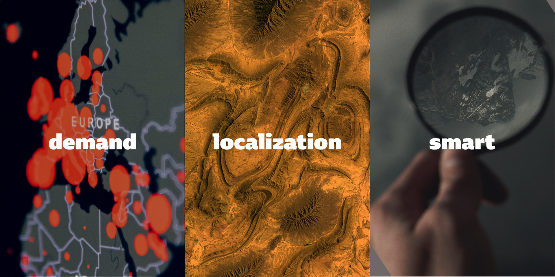
This startup proposed to provide geolocalized data about local demand for different services based on scraped data about events, weather, and news.
Challenge & Strategy
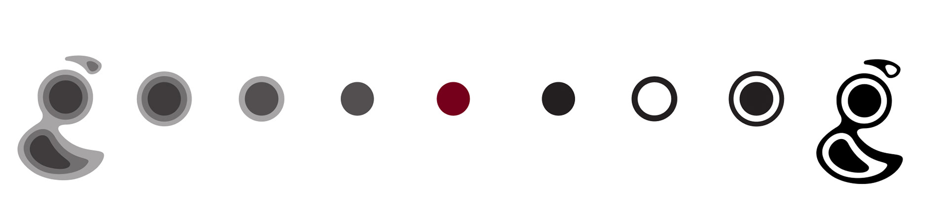
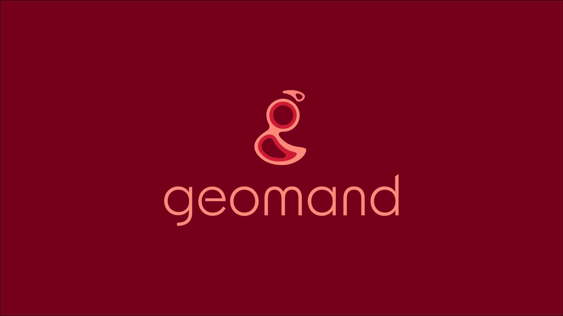
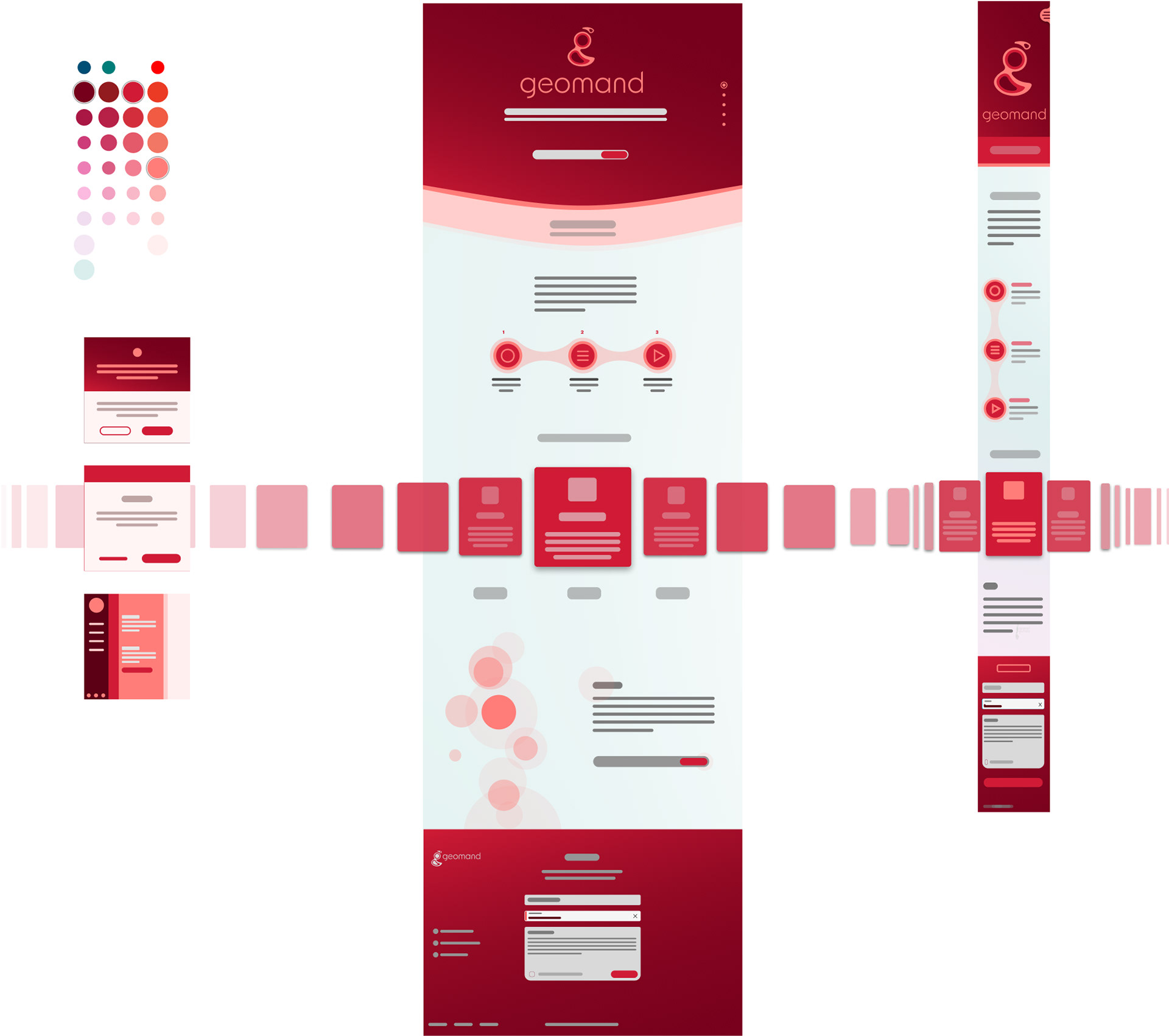
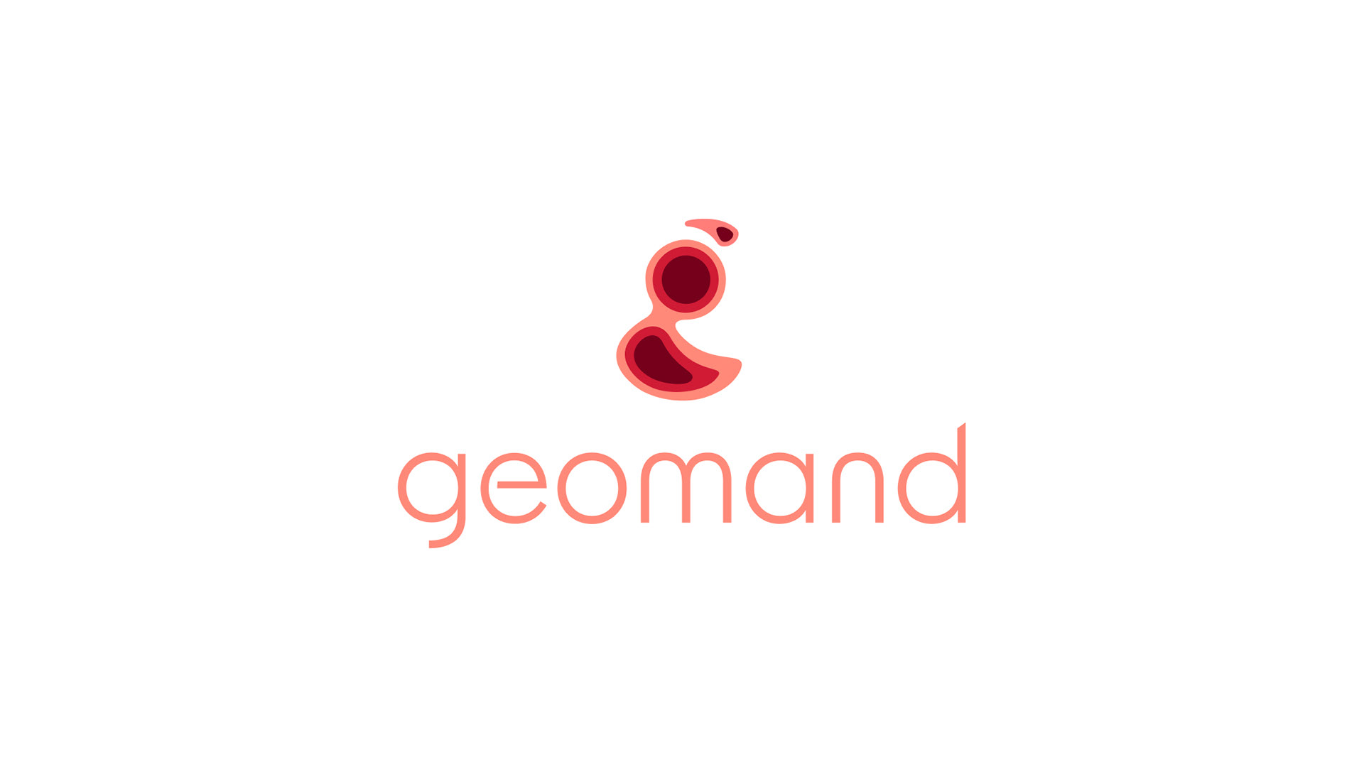
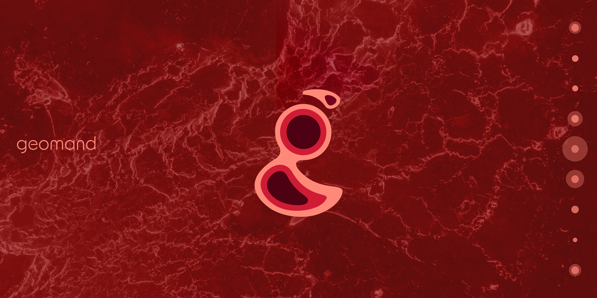
Communication goals: Produce a communication system that directly represents the service, avoiding the "pin" sign that is so ubiquitous in this kind of service. Besides that, the brand wanted to position itself as more serious than the competition—more competent but still friendly.
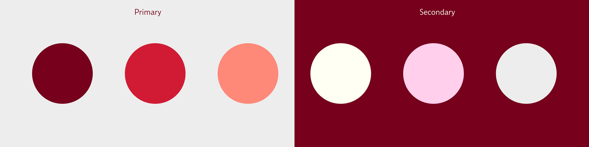
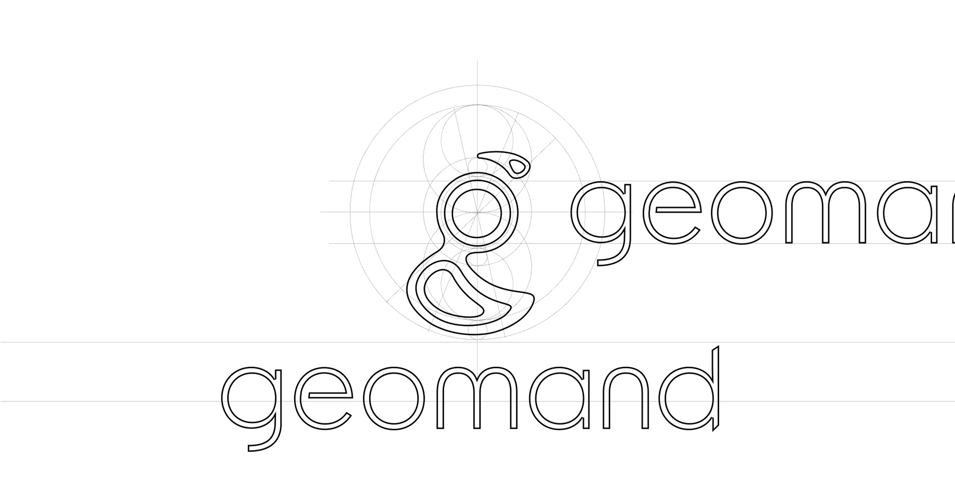
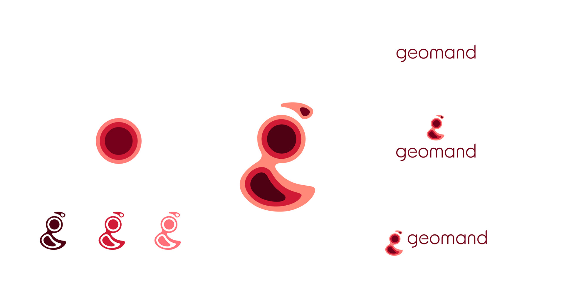
Process: The project allowed us to be rather playful in terms of shape, and even demanded it since the "pin" was out of the way. But this also asked for more "millimetric" work to find the perfect shape. The rather organic alternative chosen is a challenge in itself, as it requires well-thought-out curves. The rather darker tone of red chosen is supposed to communicate the brand's more serious approach.
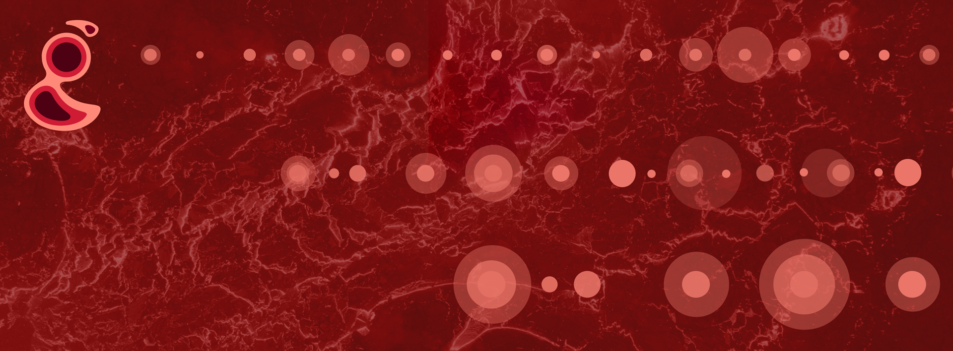
There's also the difference in background color. Lighter tones for rather informative areas of the product design and red tones for marketing and communication.
Team:
Douglas Costa (Graphic Design & art direction) & Andy (art direction)